A collection of identity marks developed for clients and exploratory projects
Selected Marks
A collection of identity marks developed for clients and exploratory projects.
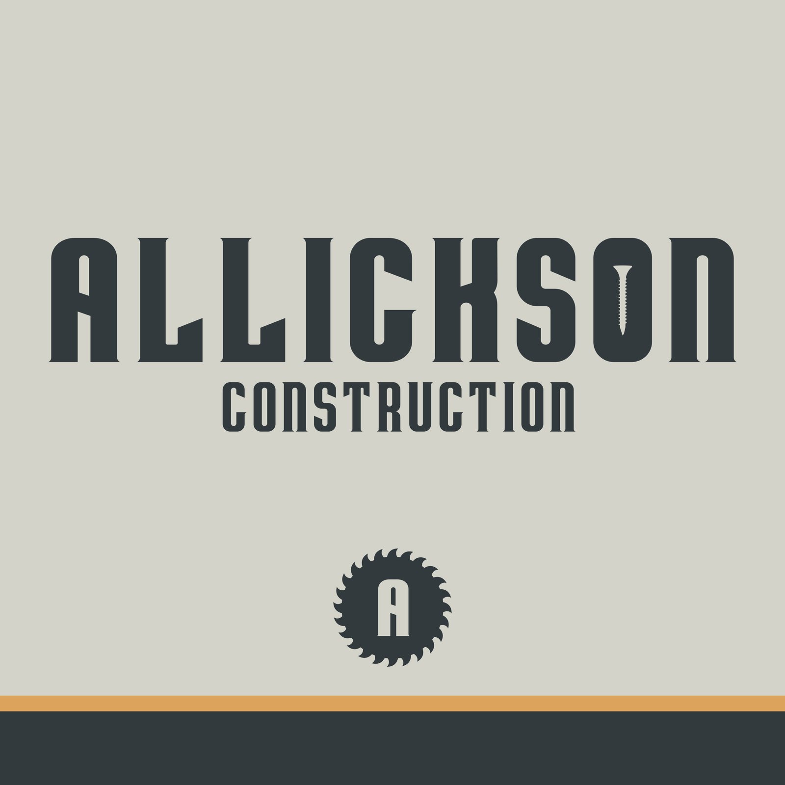
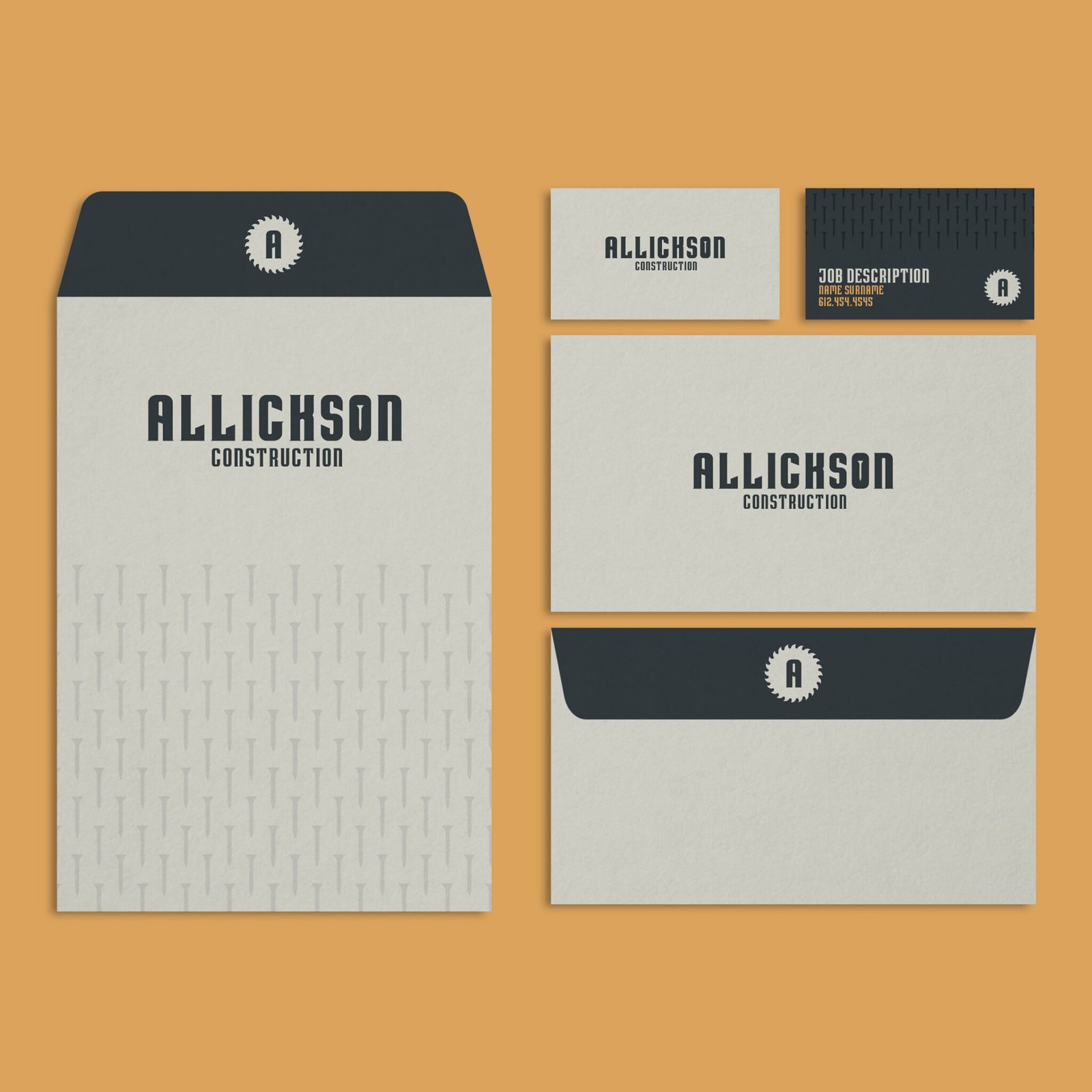
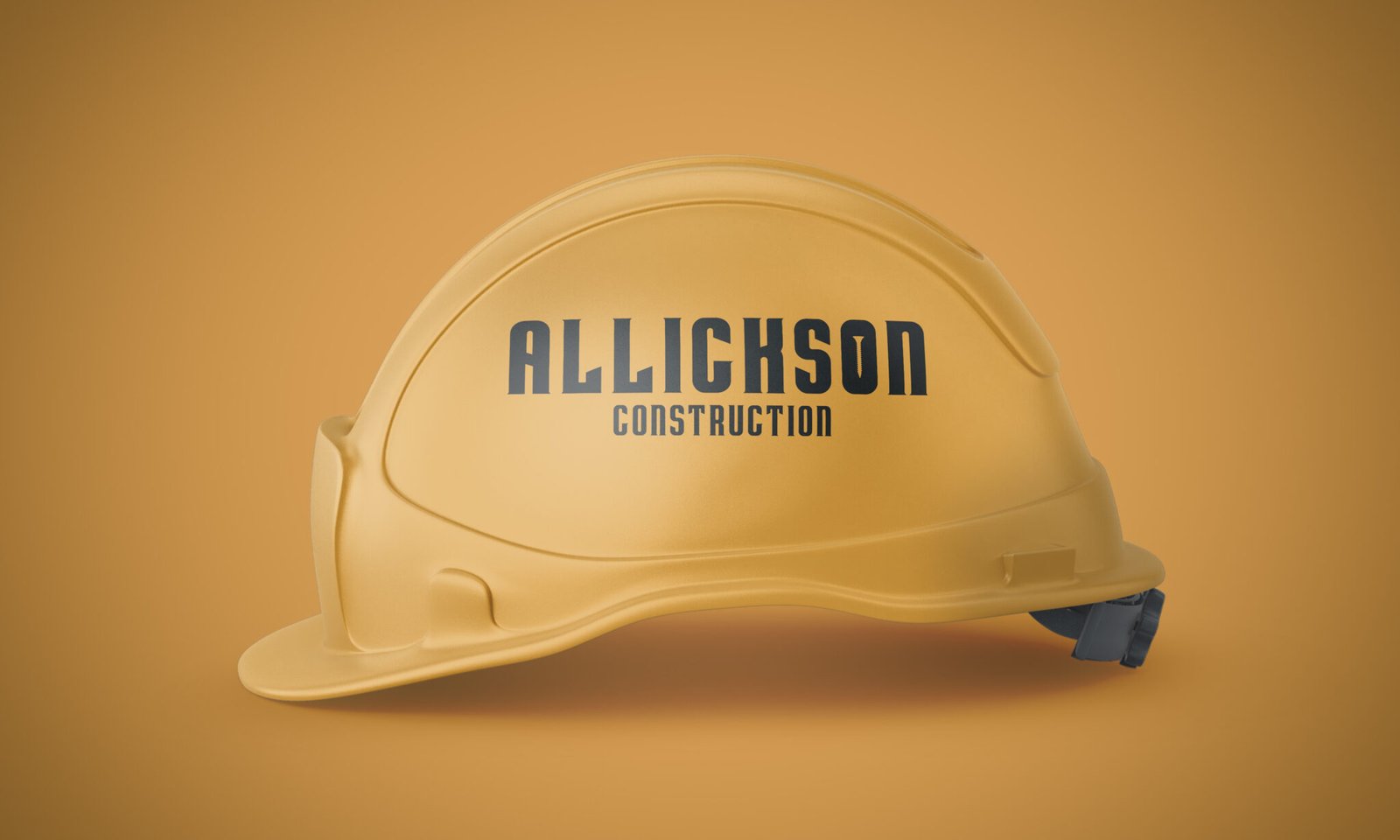
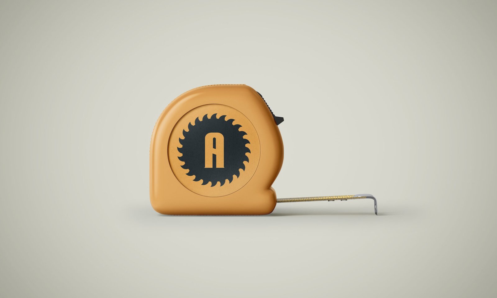
Allickson Construction
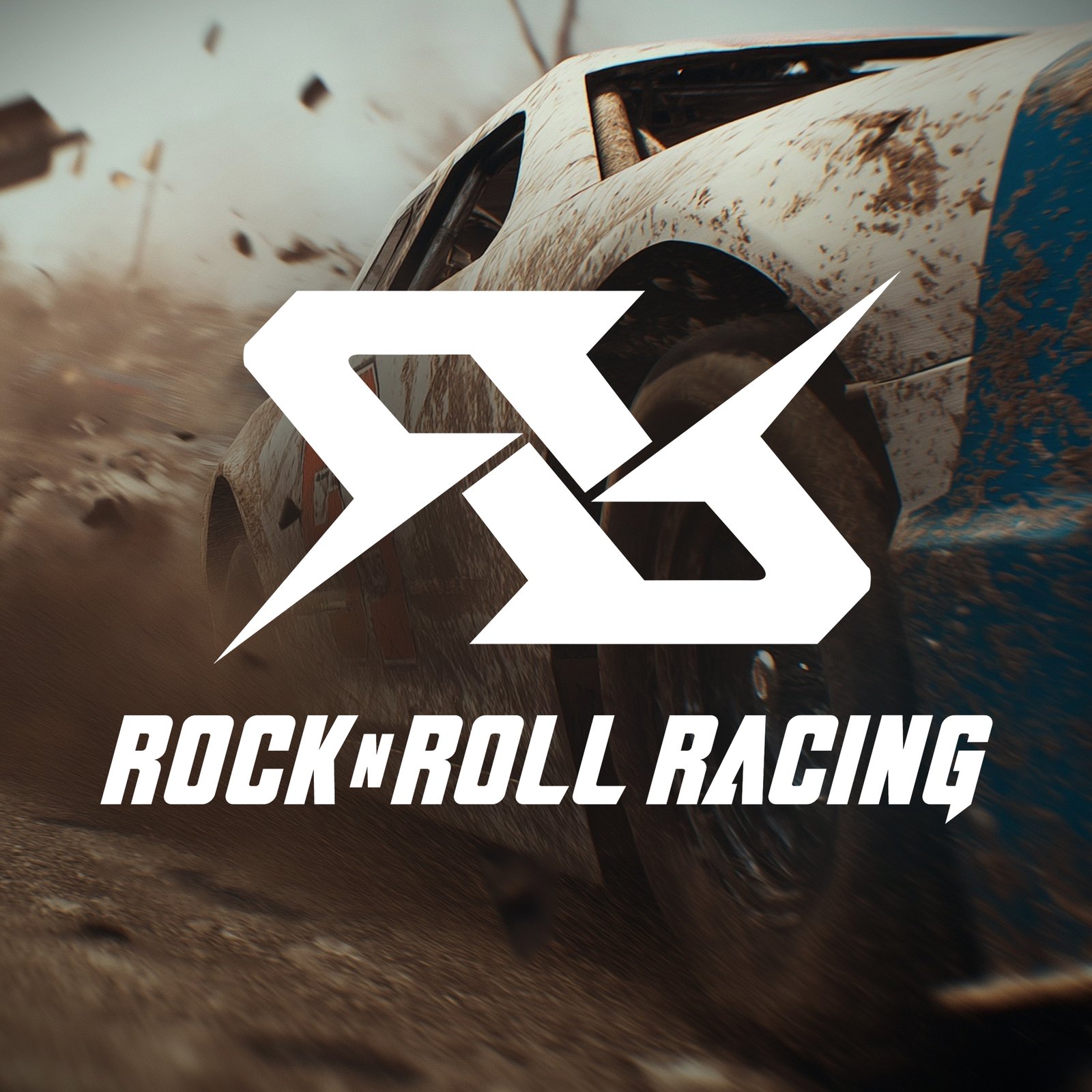
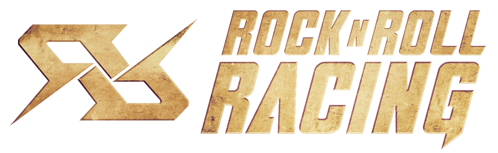
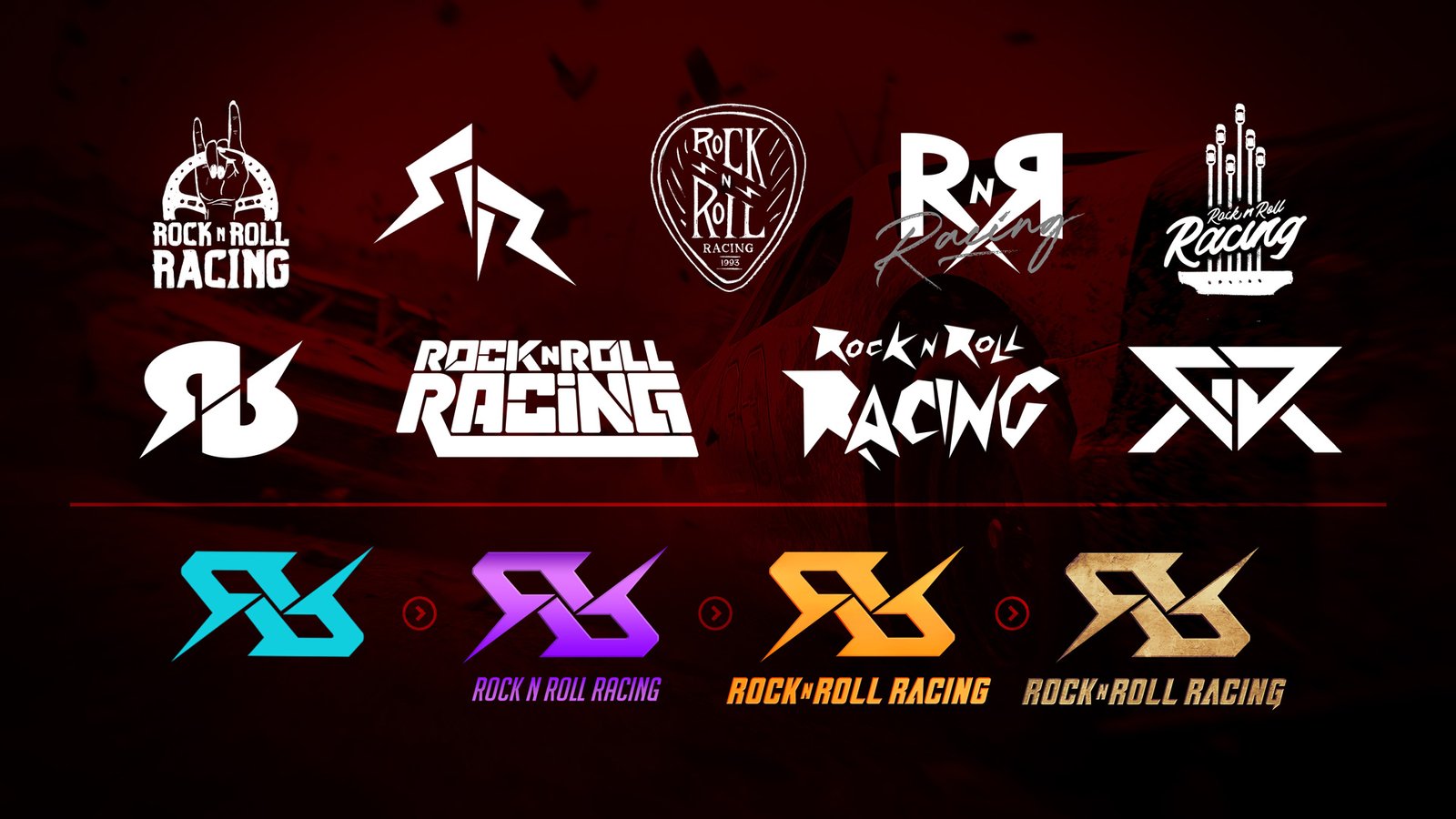
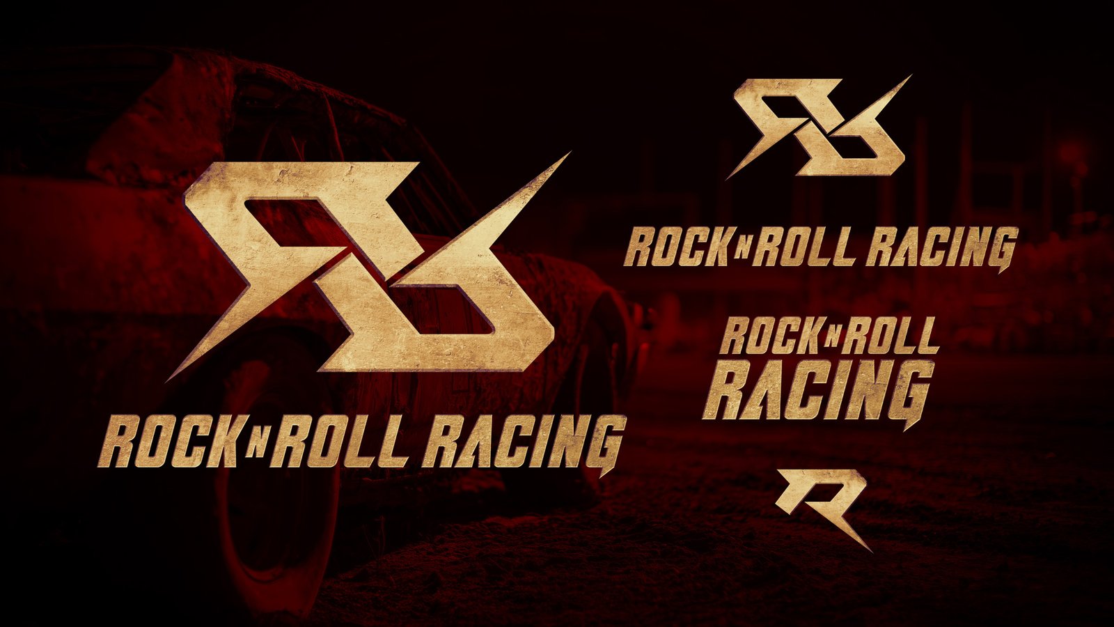
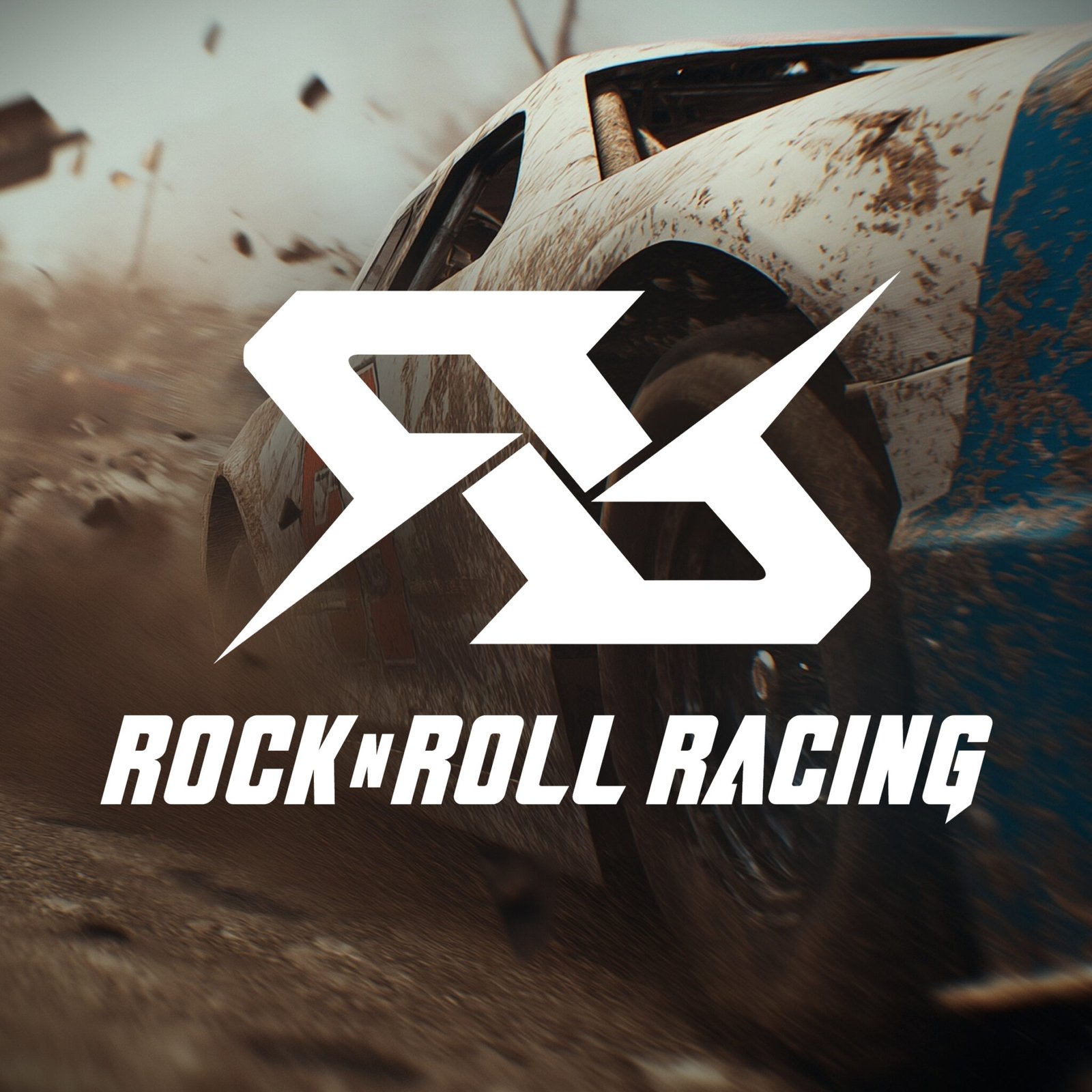
Rock n Roll Racing
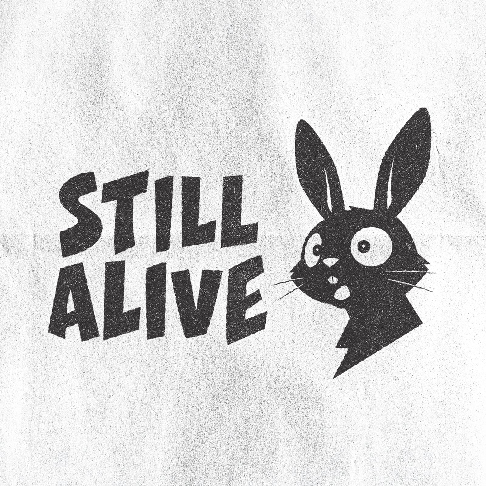
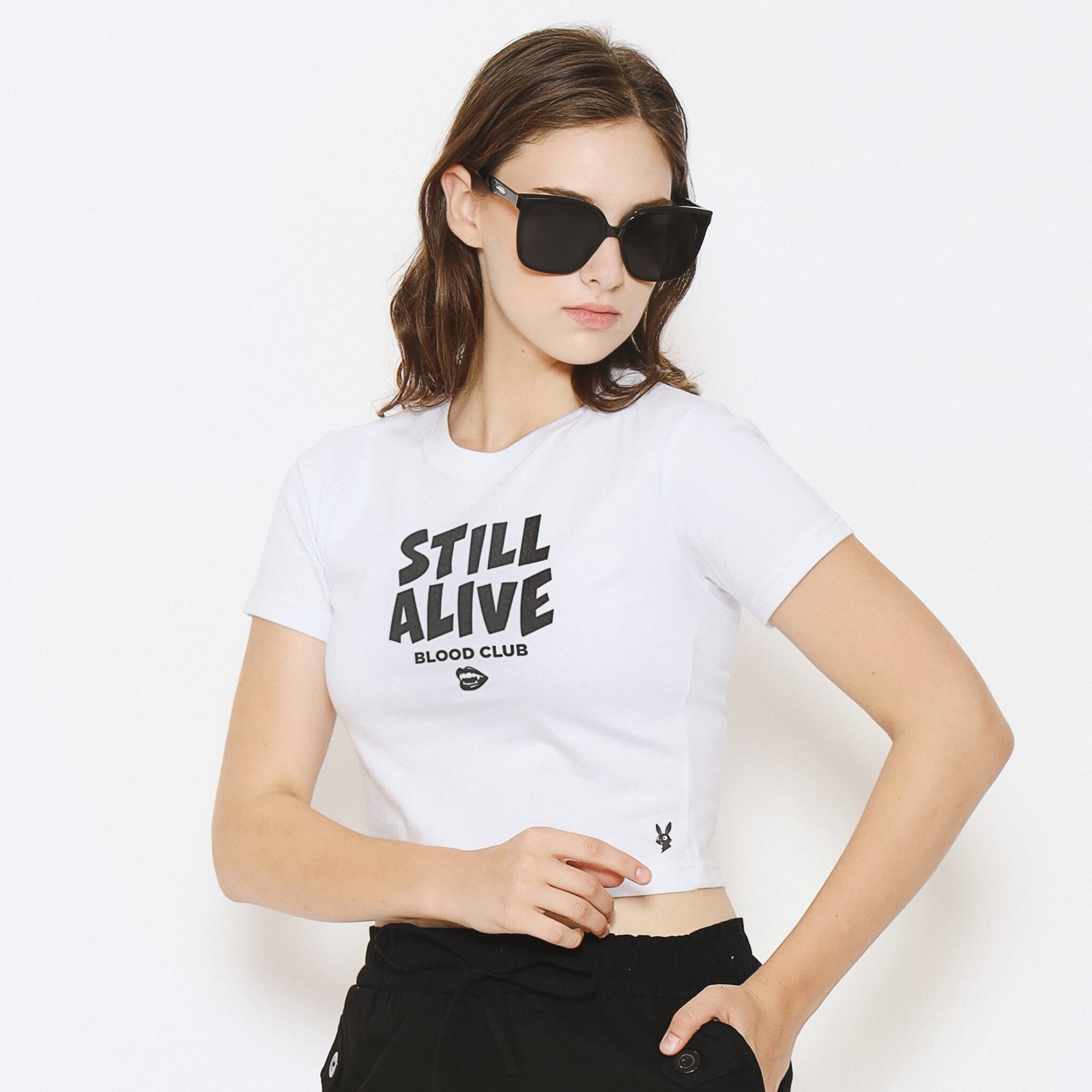
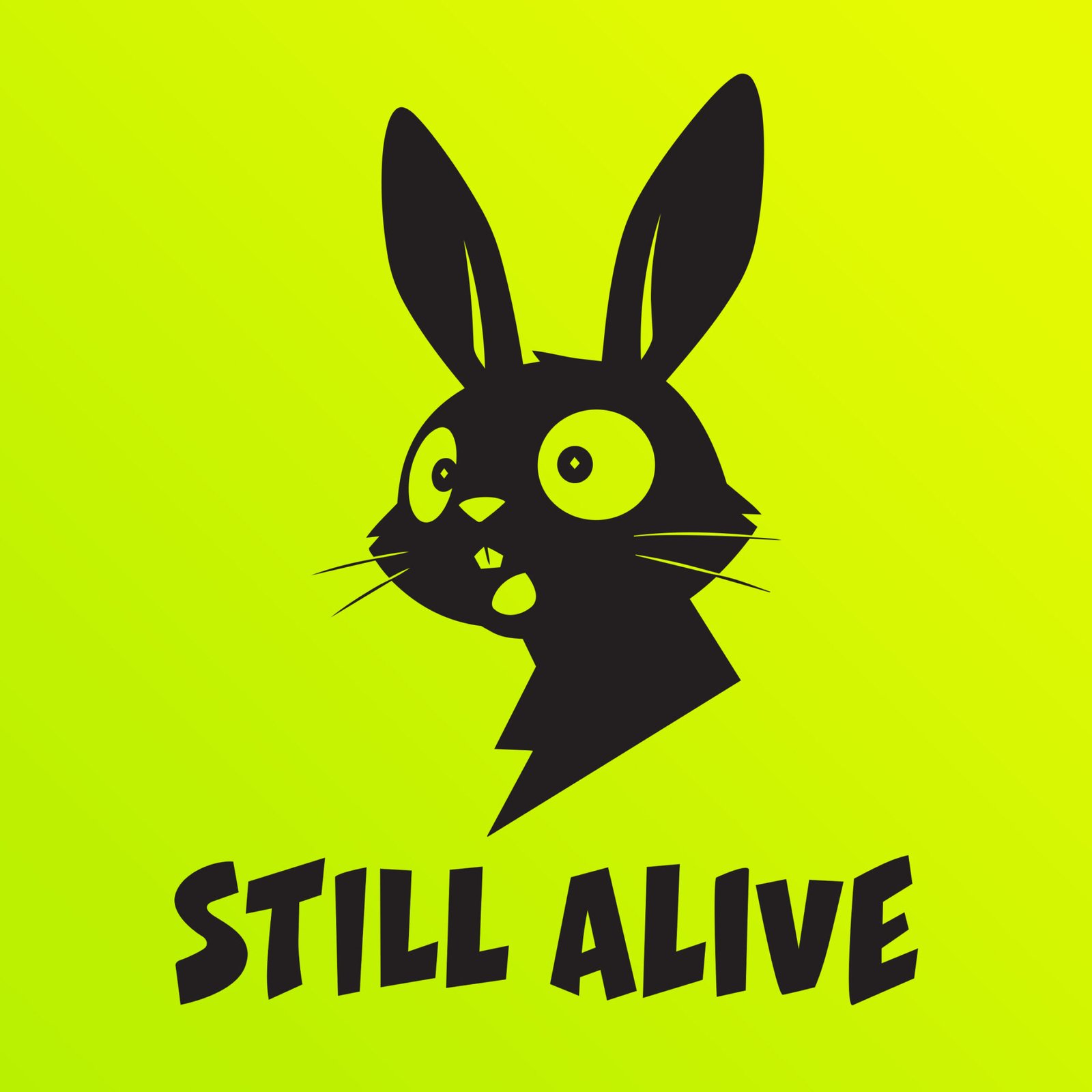
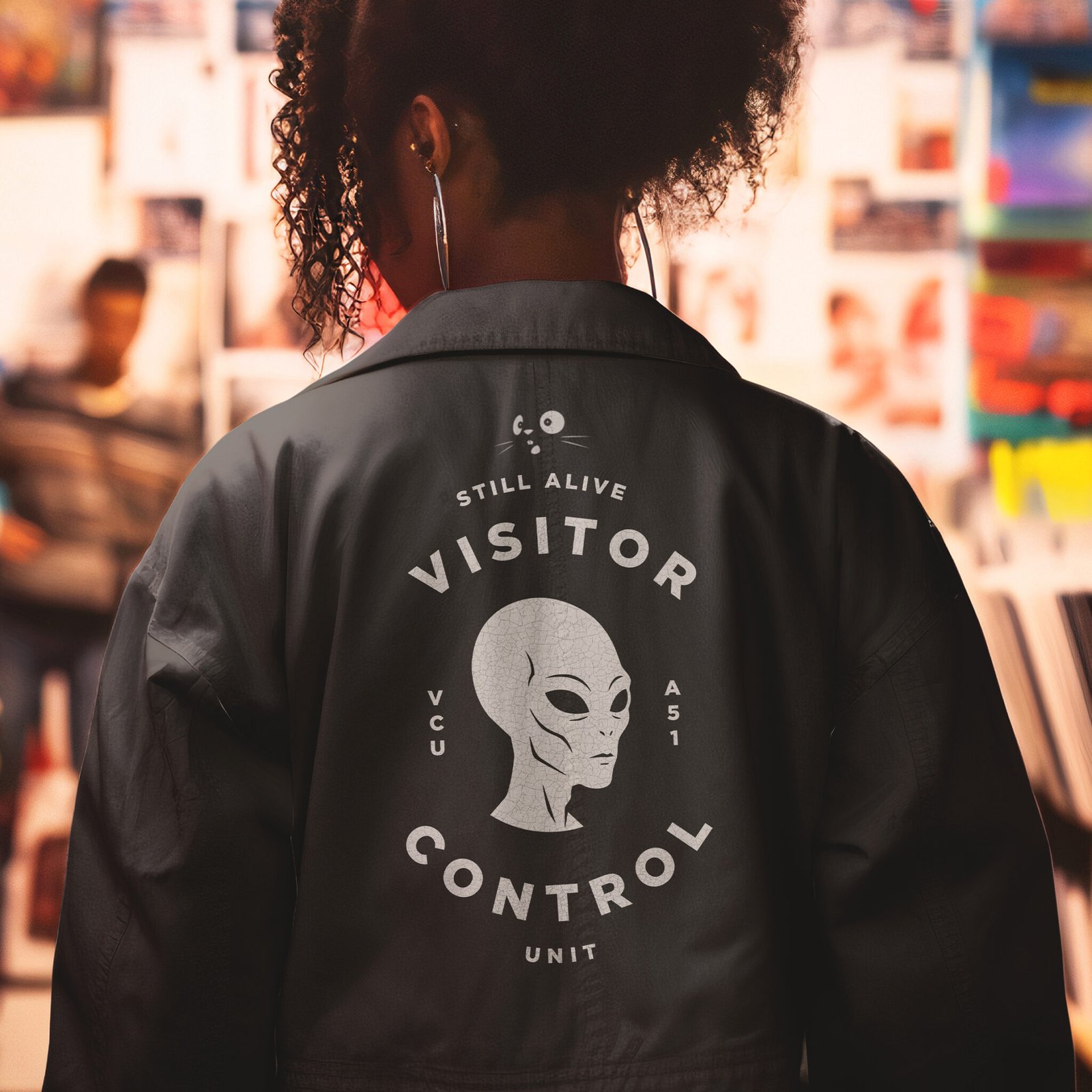
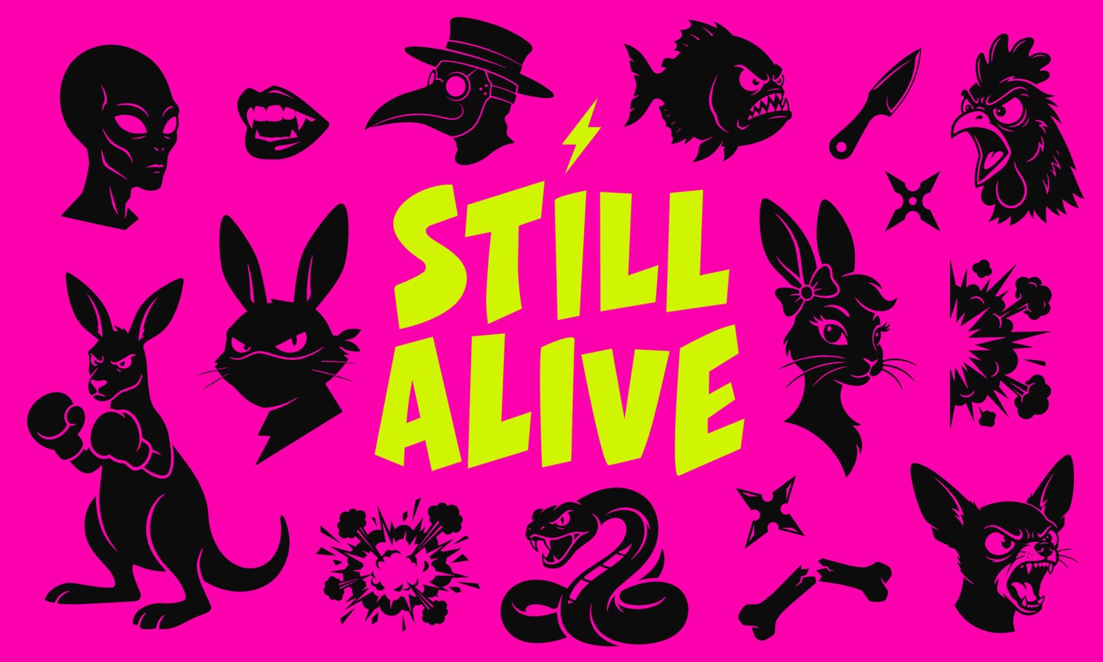
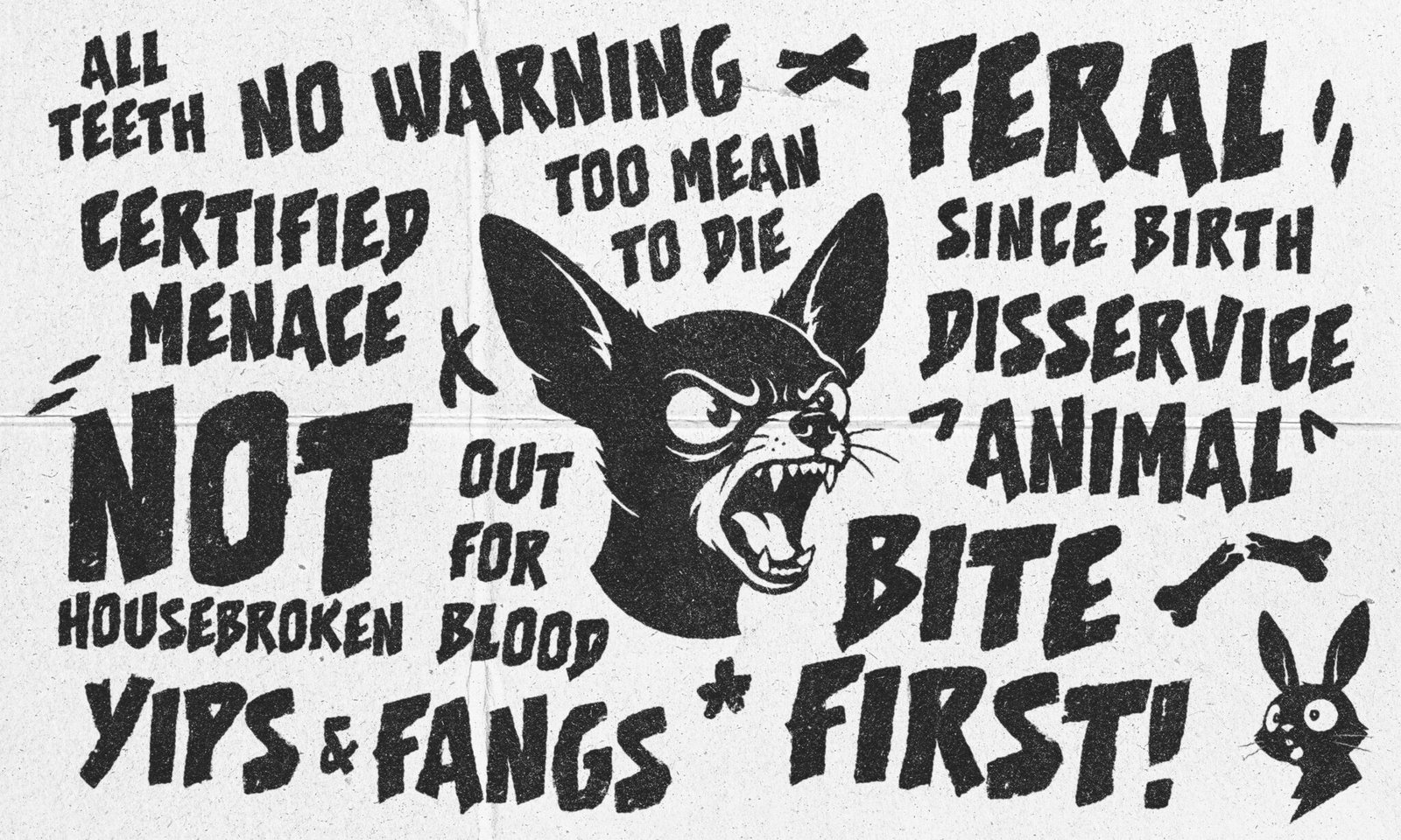
Still Alive Clothing Co.
Appleton Area Heath Services
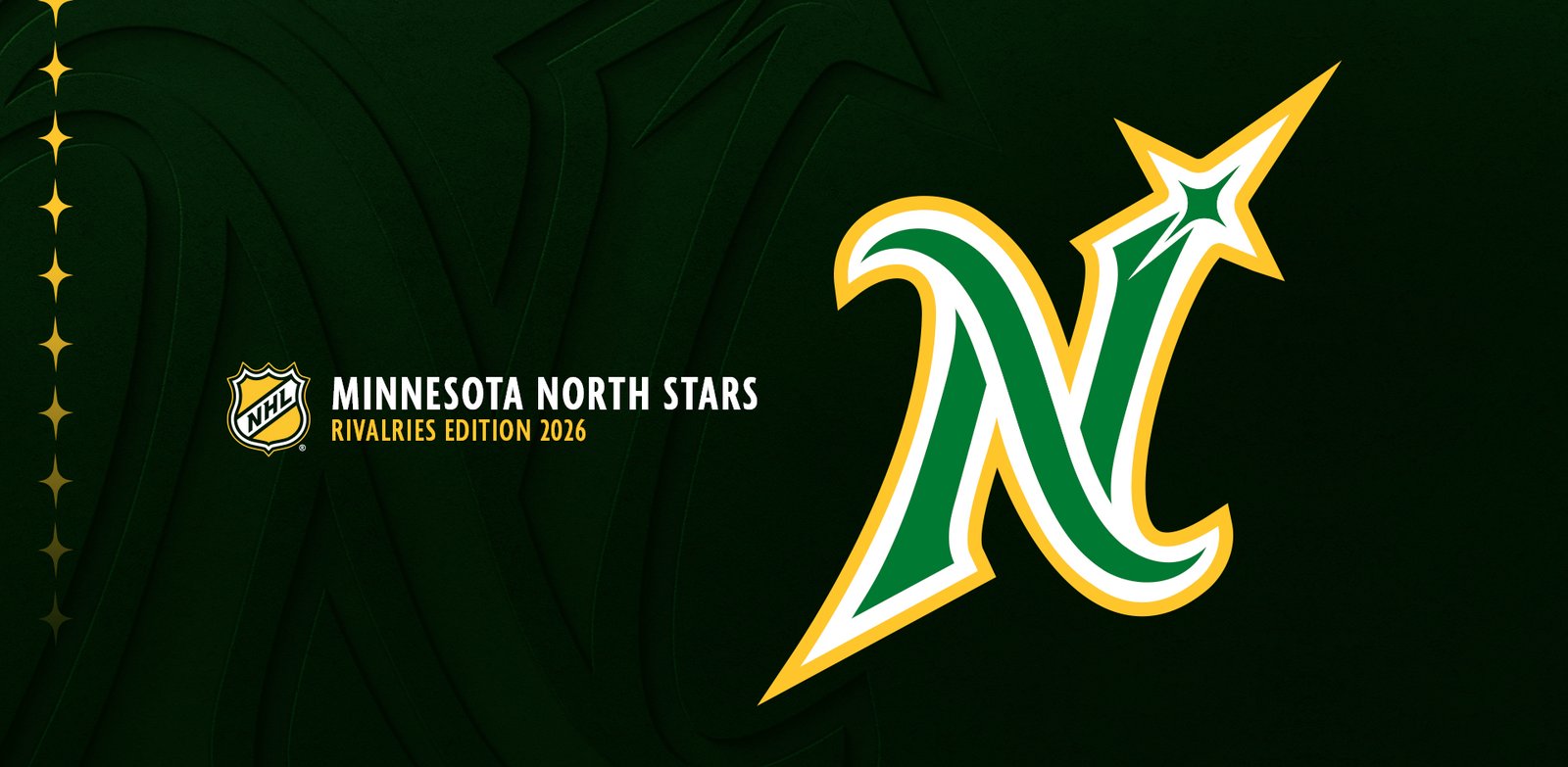
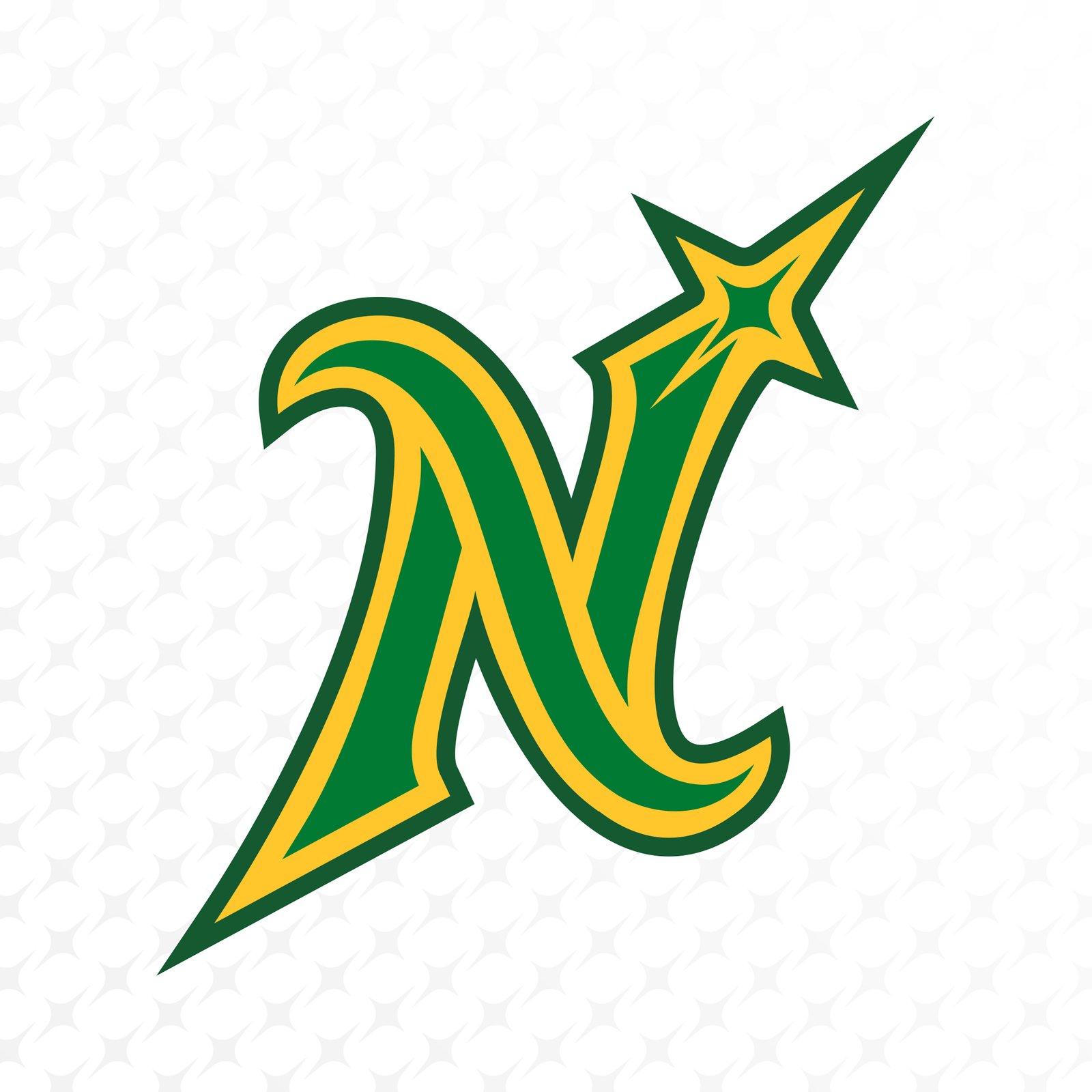
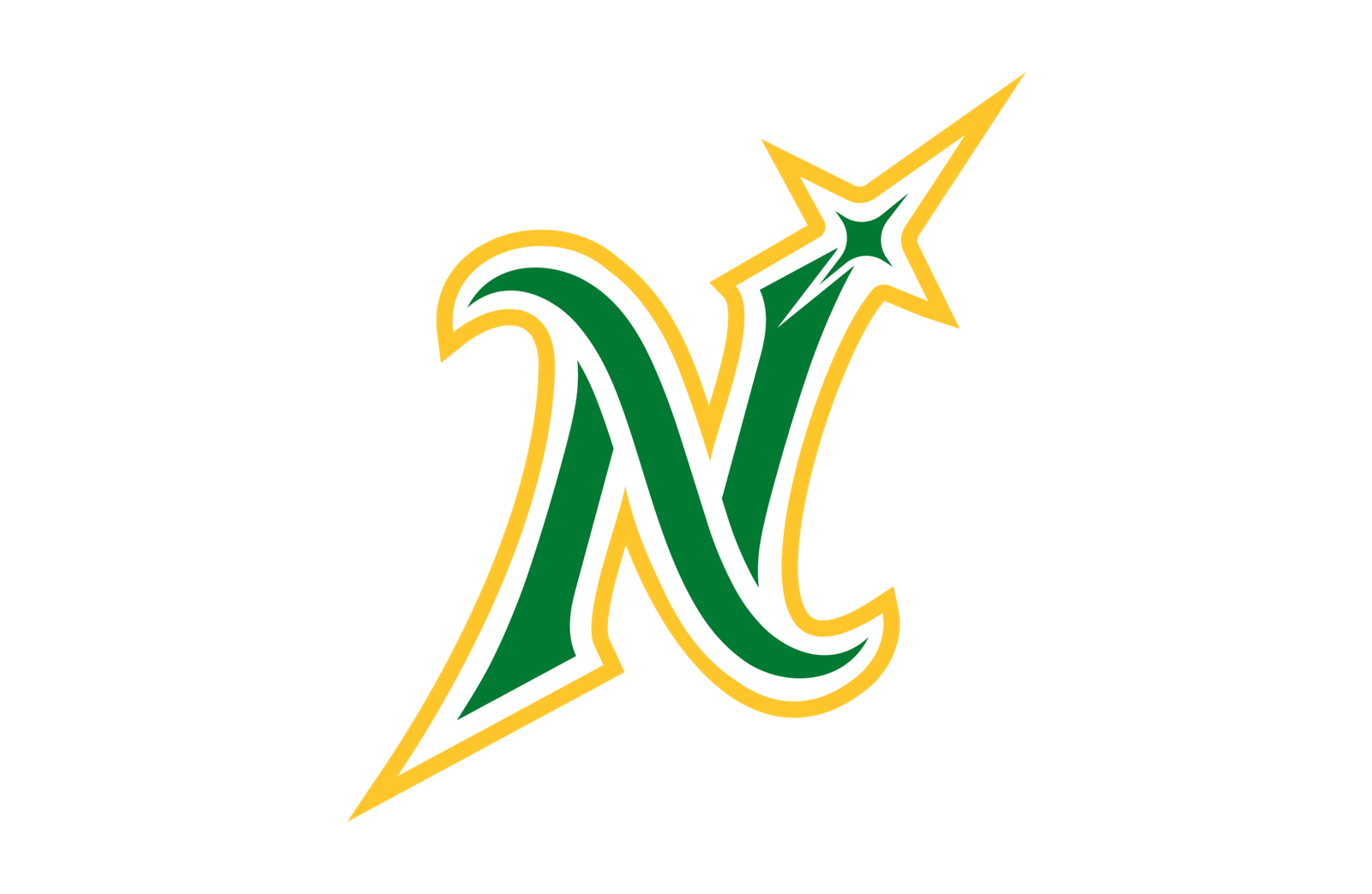
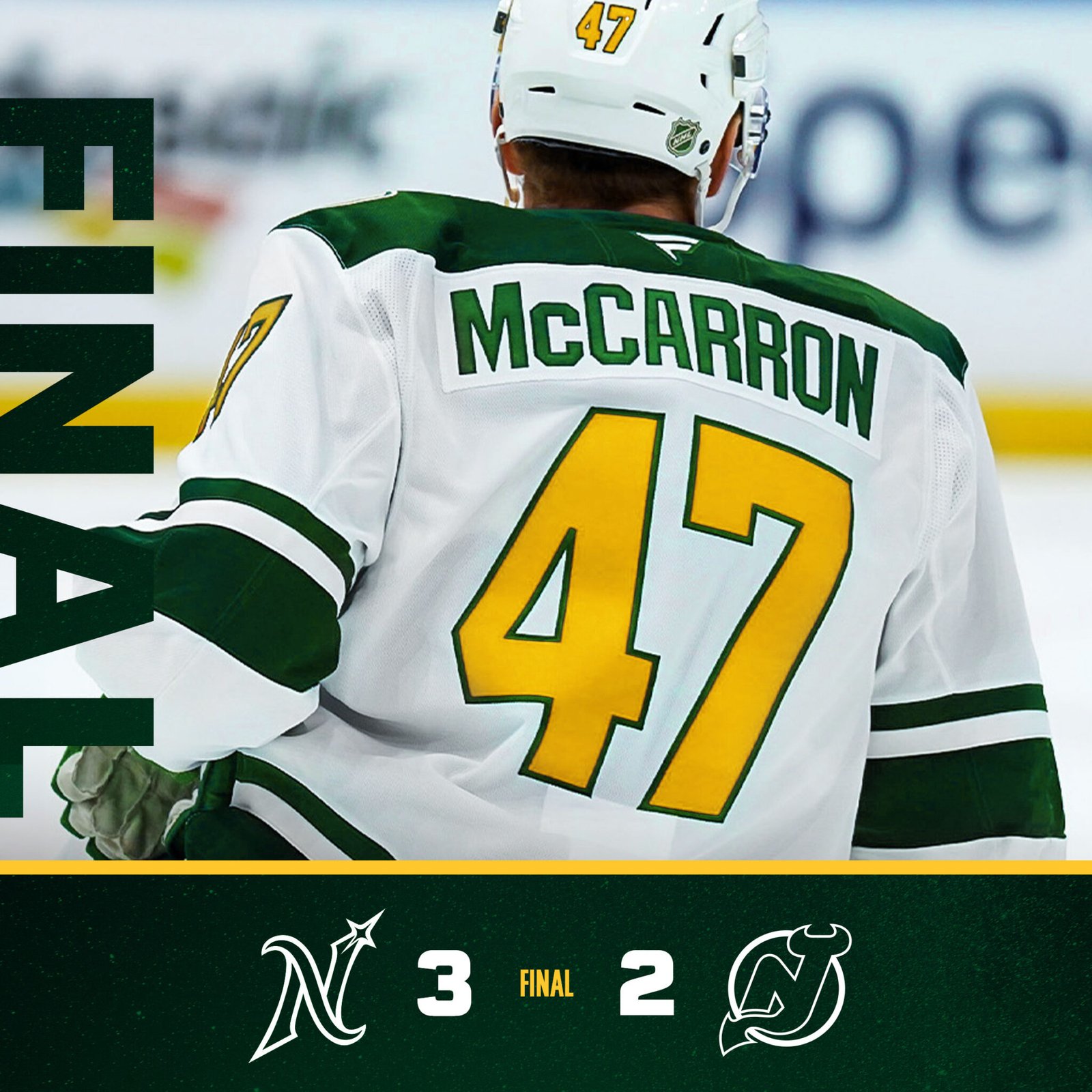
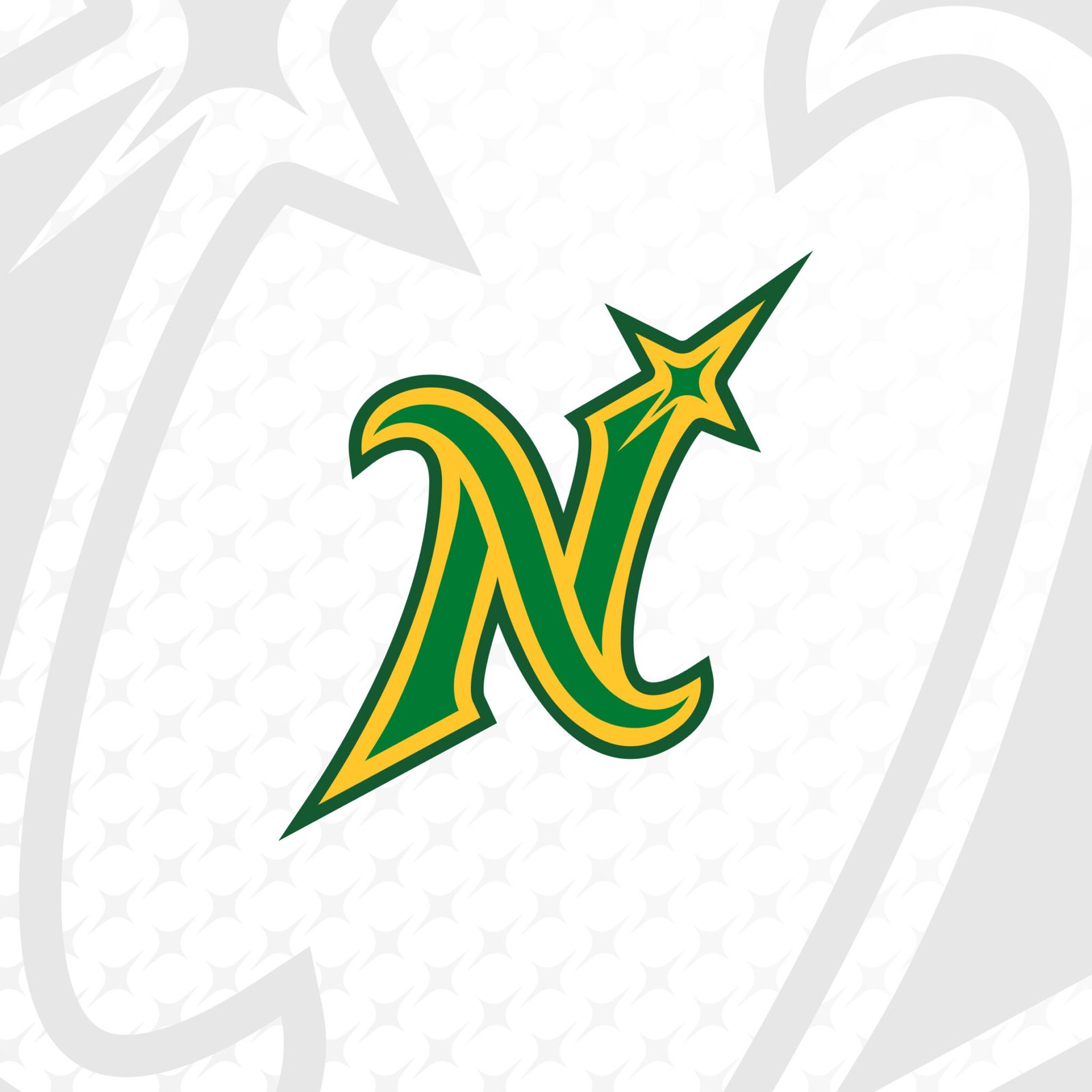
Minnesota North Stars
Allickson Construction
Rock n Roll Racing
Still Alive Clothing Co.
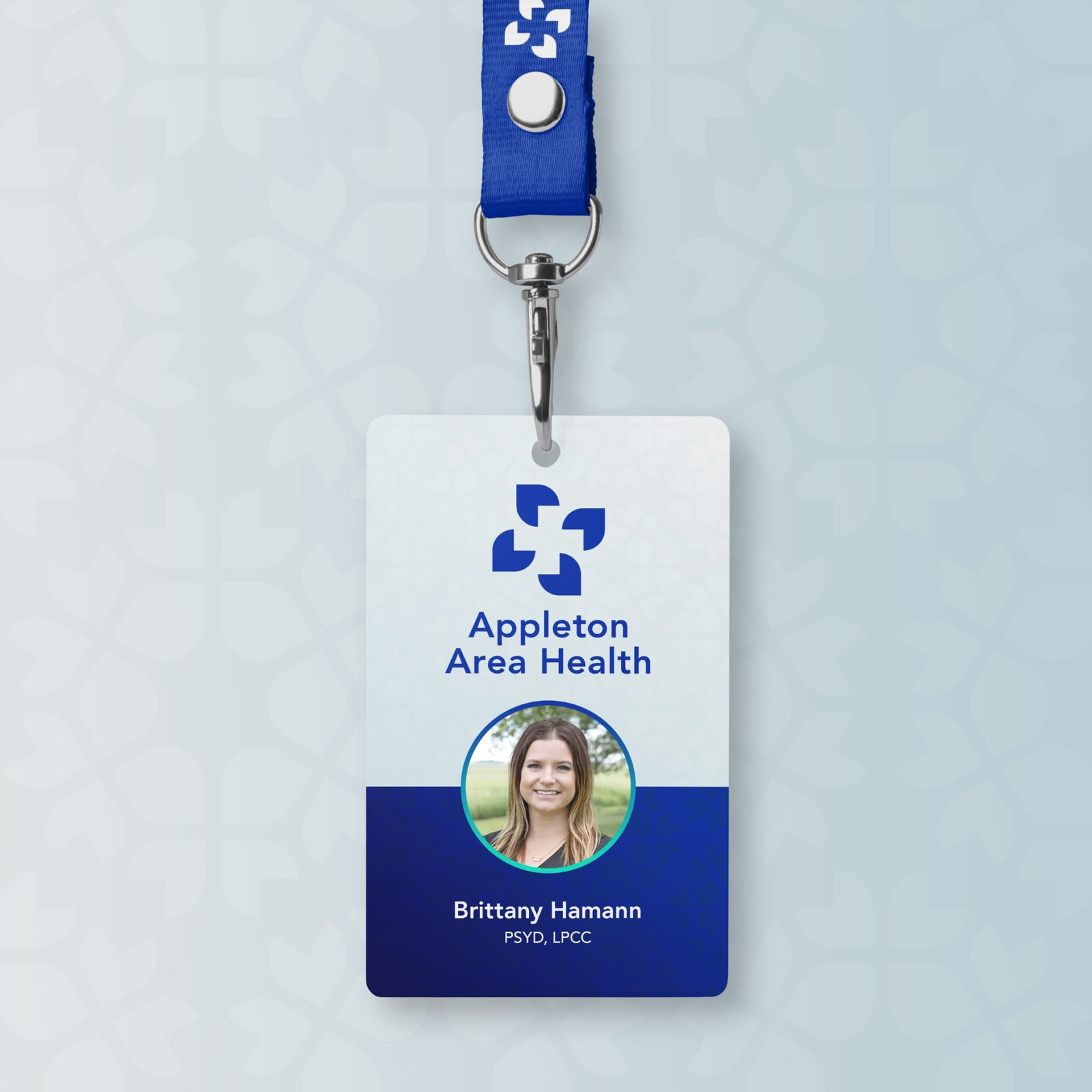
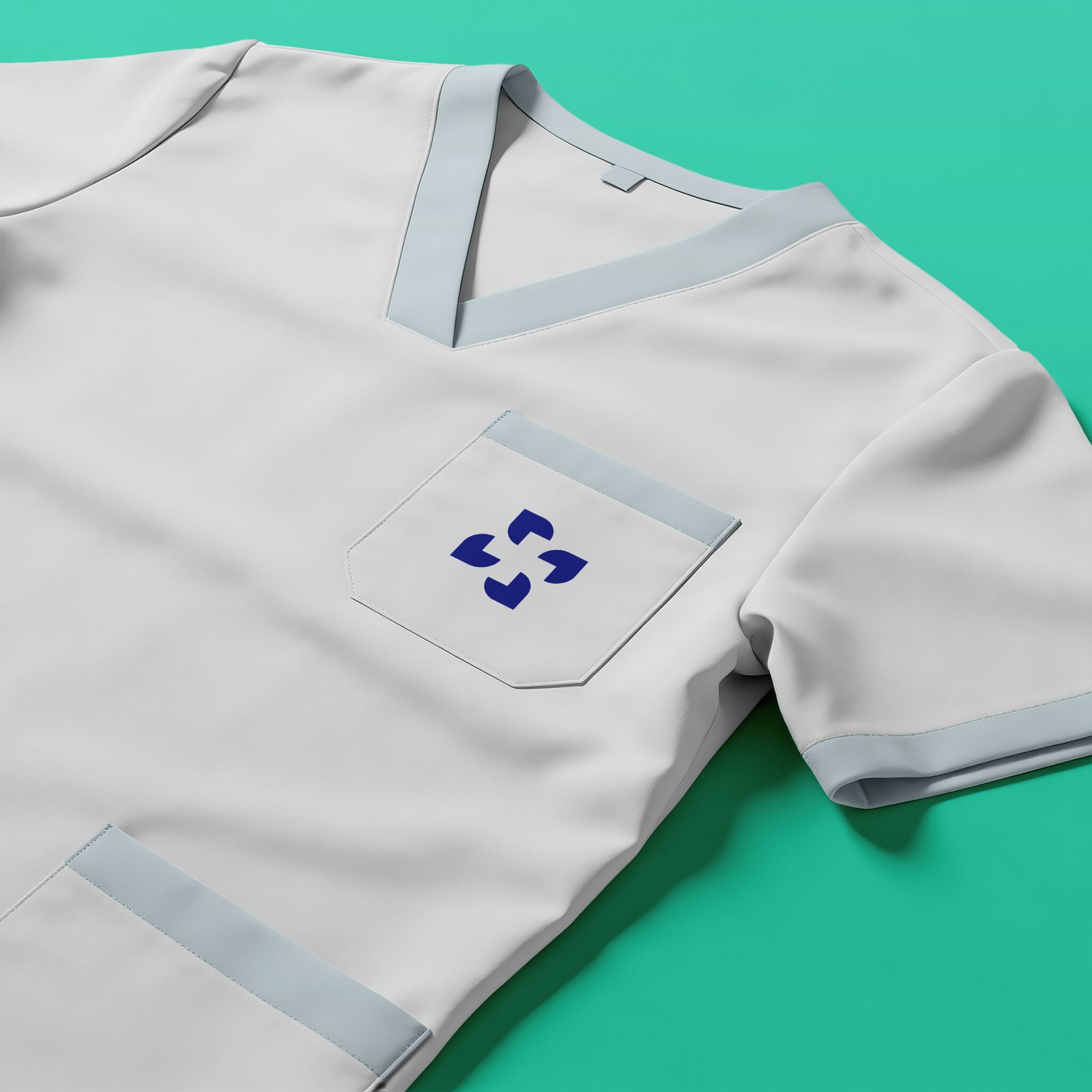
Appleton Area Health
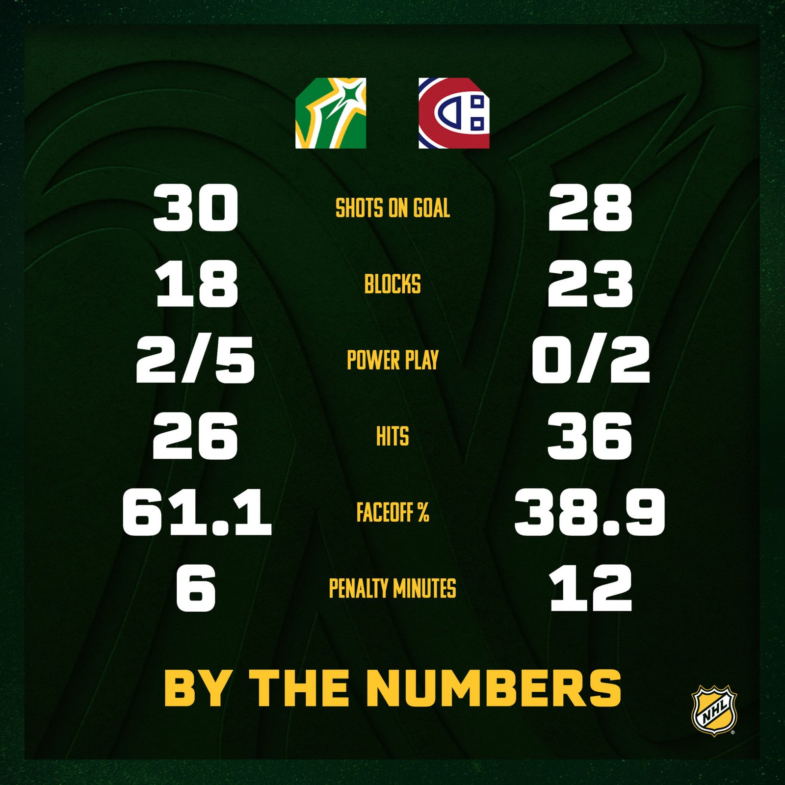
Minnesota North Stars
Built to Last
Allickson Construction wanted a brand that felt as solid and dependable as the work his team delivers. I designed a strong logo and a clean, straightforward identity system grounded in strong typography and subtle design details, all meant to convey craftsmanship, reliability, and pride in the work.
Metal to the Pedal
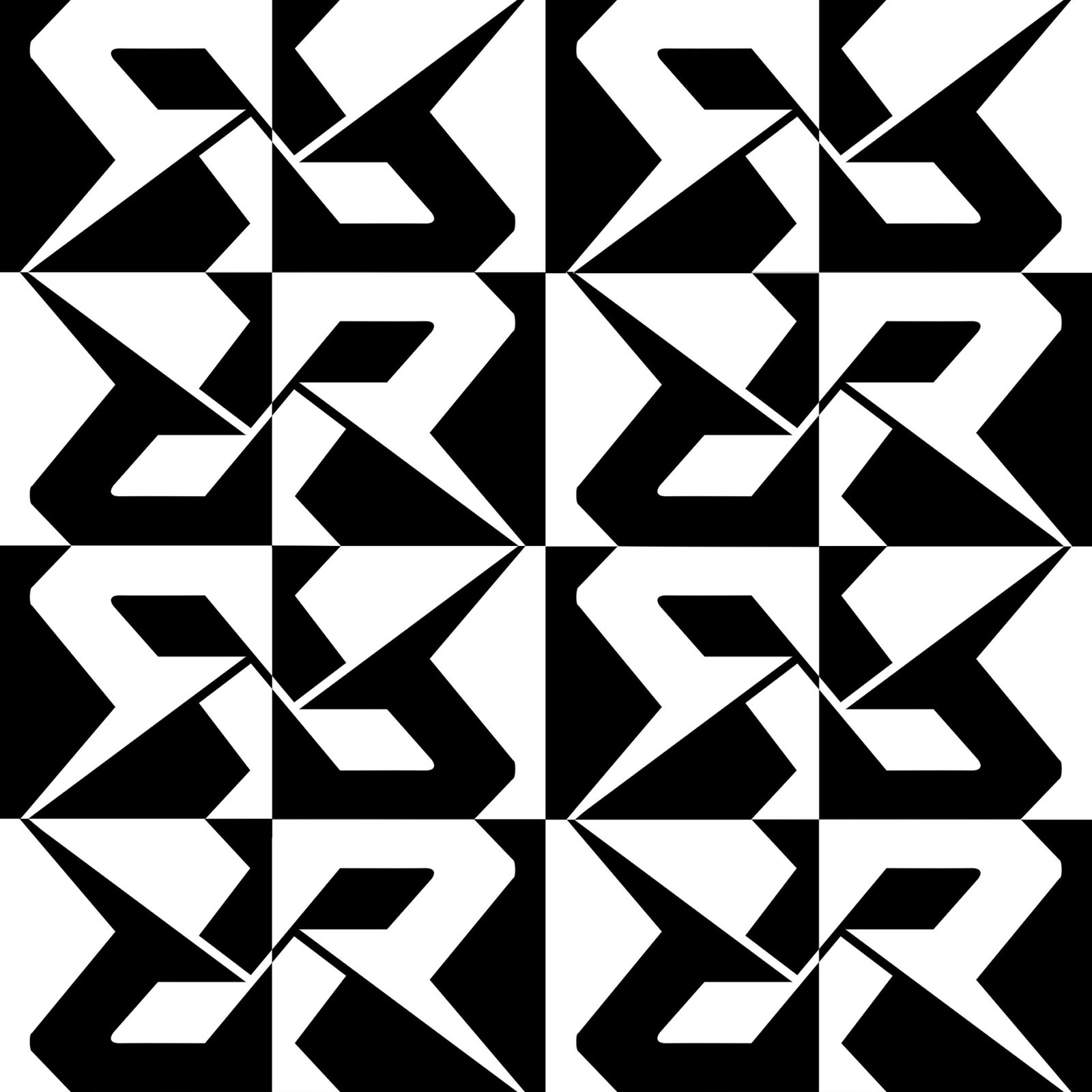
For the re-release of Rock n’ Roll Racing, I created a refreshed identity that keeps the game’s aggressive, high-speed personality intact. The mark is built from two interlocking R’s, with racing flags formed through the negative space, while metallic finishes and distressed textures give the system a gritty, battle worn feel rooted in the game’s rock and roll racing aesthetic.
Hard to Kill
Still Alive is a clothing brand built around a skittish rabbit who looks like he’s survived more than a few close calls. I created the rabbit as the main mark, then expanded the identity into a cast of enemies and oddball threats drawn in the same sharp, graphic style. Loud color, rough typography, and slightly unhinged character work give the brand a playful punk energy that can shift easily across apparel, graphics, and merch.
Care in Every Direction
Appleton Area Health needed a refreshed identity built around four simple forms working together as one. Each shape represents a core area of care: primary care, mental health, preventive care, and rehabilitation. The shared structure reflects a more connected approach to patient wellbeing. A clean geometry and calming palette can scale that easily across staff materials, signage, and patient communications.
The North Remembers
For the Minnesota Wild Rivalries Edition, I developed a special edition identity inspired by the Minnesota North Stars and the state’s hockey history. The custom letter mark, star detail, and green-and-gold palette reference the original team while giving the system its own distinct look. Designed for select rivalry games, the identity extends across jerseys, matchup graphics, and in-arena presentation as a modern tribute to Minnesota hockey’s past.