Hell's Ink Tattoo Tour
Mark of the devil?
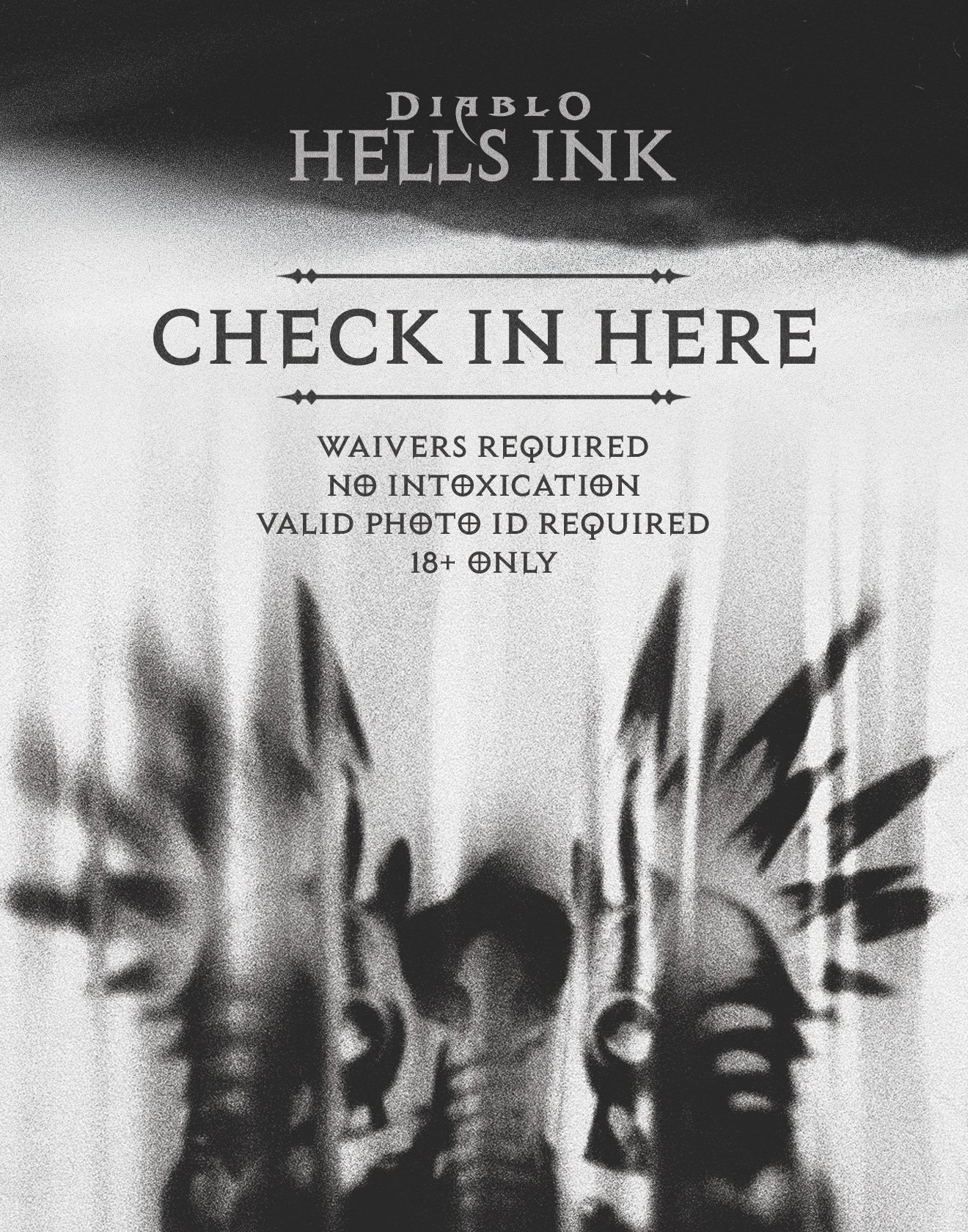
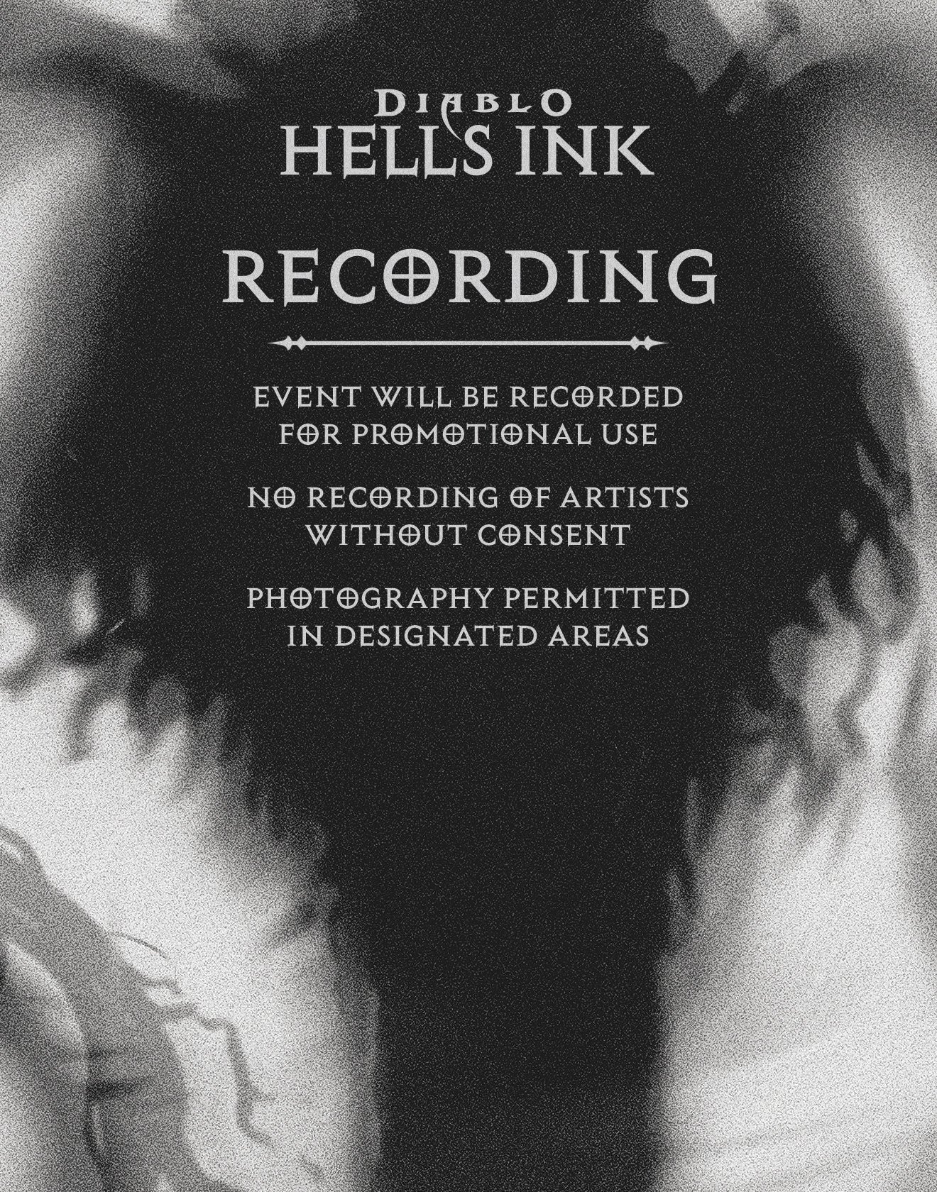
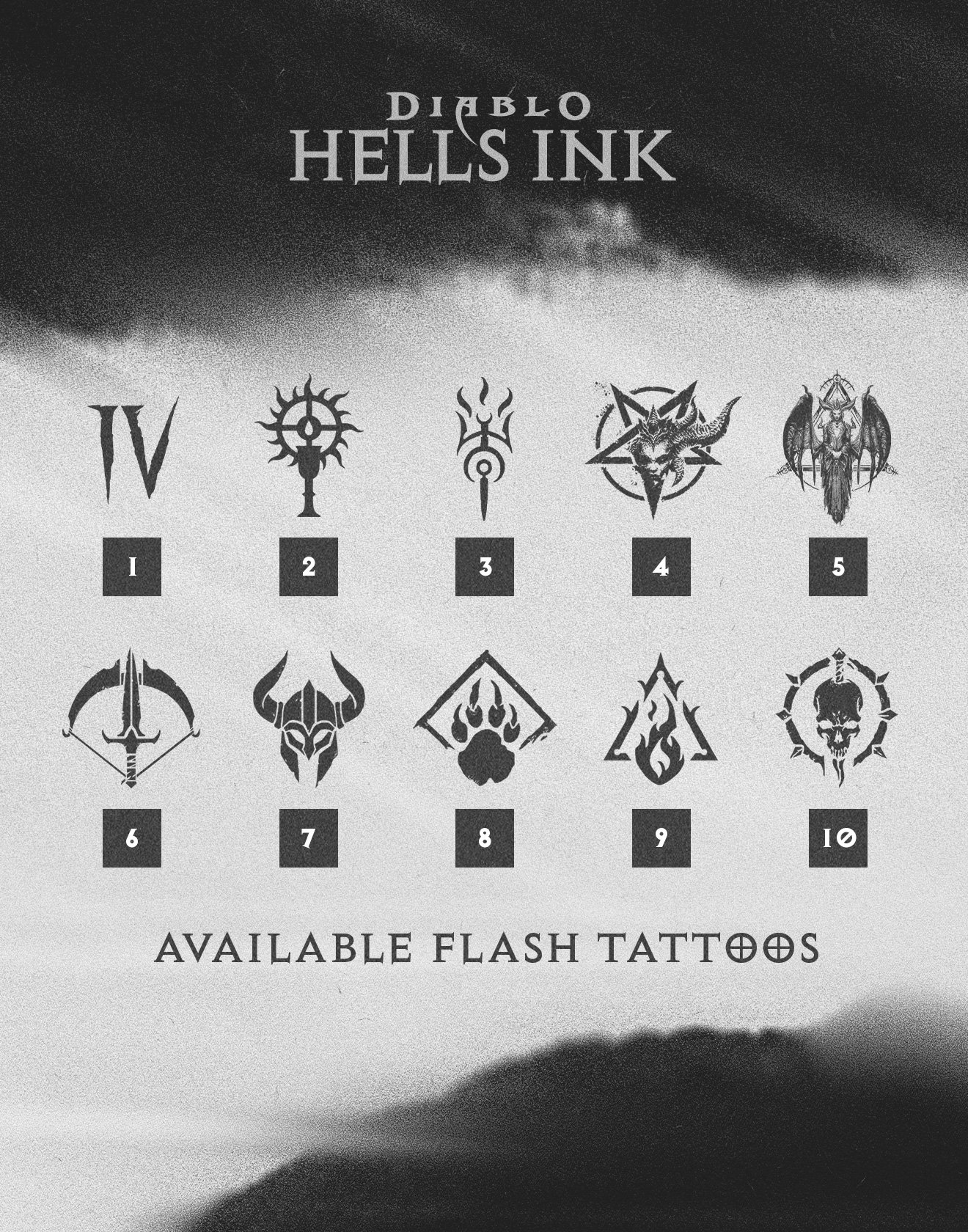
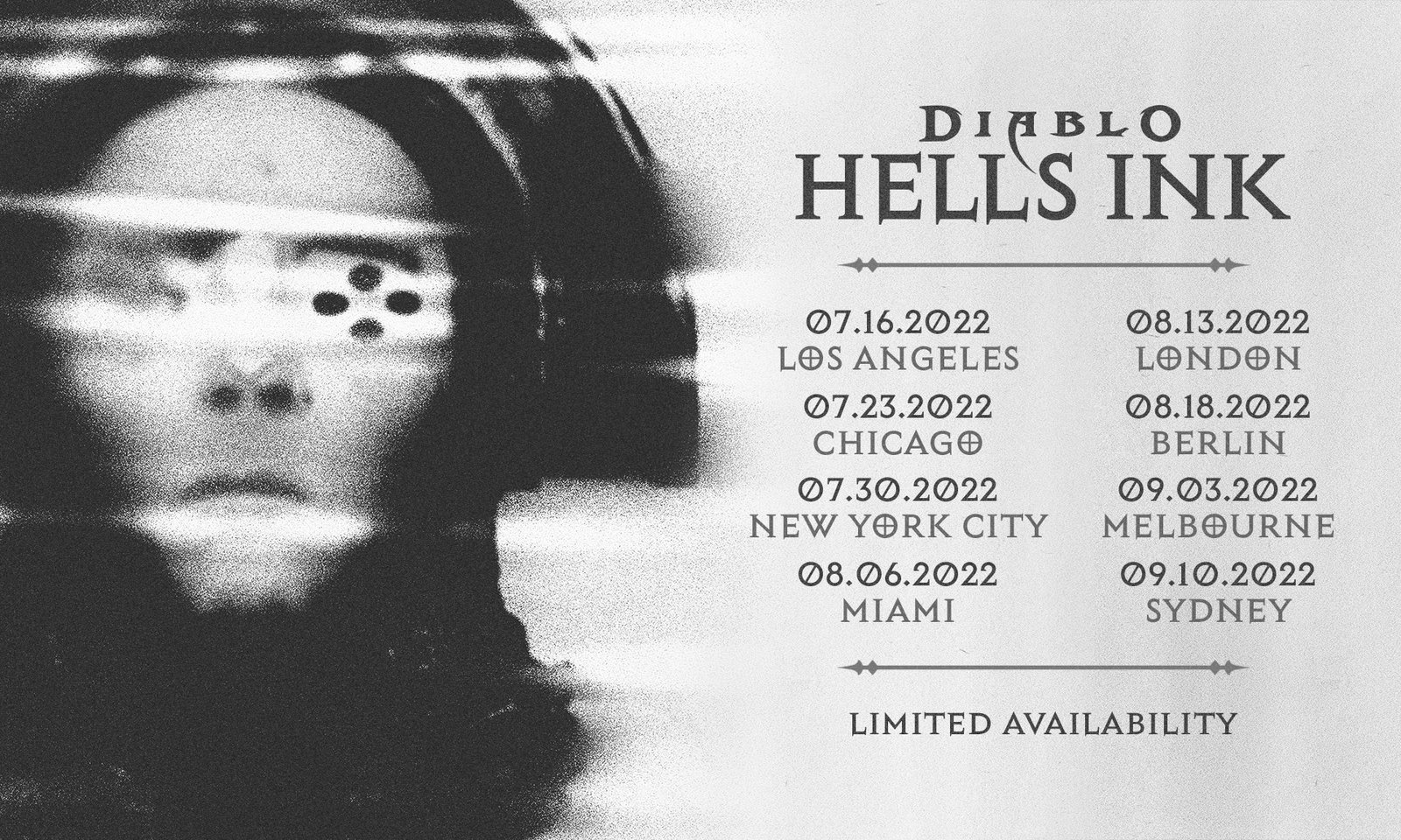
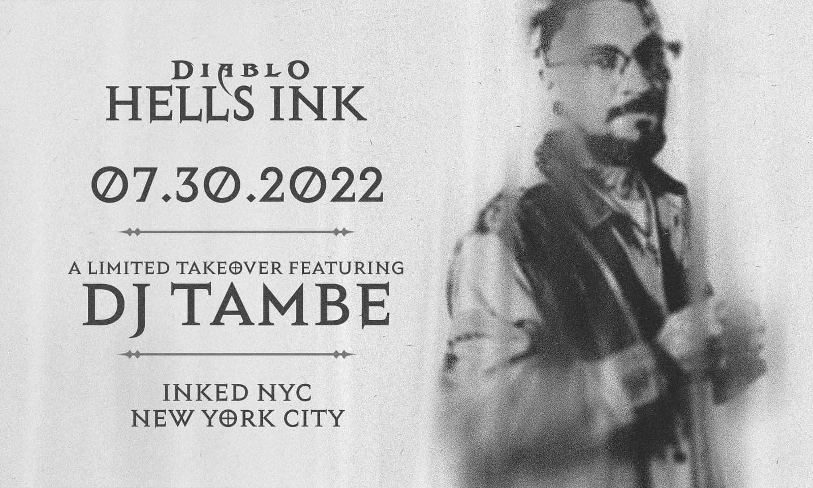
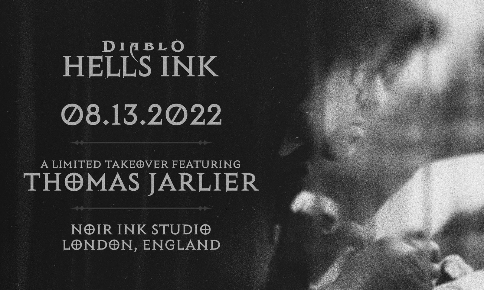
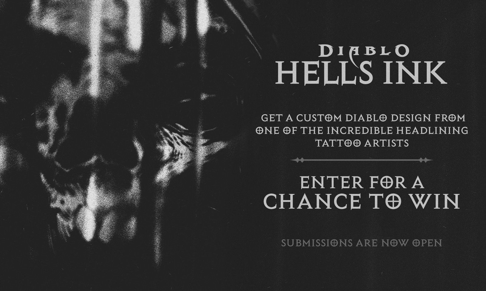
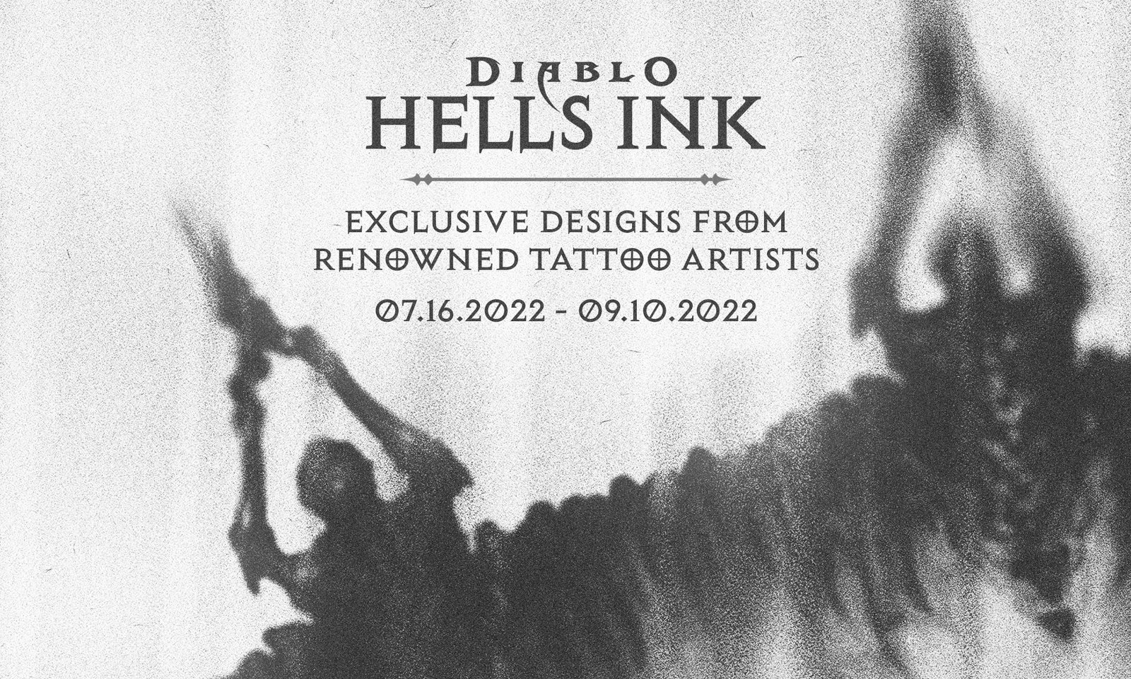
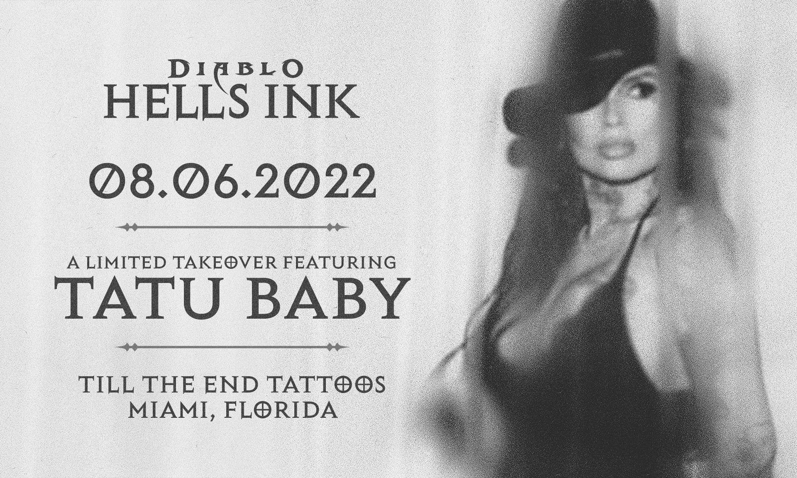
Hell’s Ink was a multi-city tattoo shop takeover tour designed to bring Diablo IV into the real world through free flash tattoos, fan meetups, and high energy community events. Ahead of the tour’s expansion in 2023, I was brought on to explore a new visual direction for the campaign, a look and feel that blended tattoo culture, Diablo iconography, and the gritty atmosphere of the shops hosting each stop.
While another direction was ultimately chosen for the final rollout, these concepts remain a favorite exploration of mine, for their raw style and attitude.
How It Started
Background
The brief was to develop a visual identity for the Hell’s Ink tour that felt authentic to the tattoo world while still speaking the language of Diablo IV. The concepts needed to work across posters, signage, social assets, and environmental applications inside the participating tattoo shops.
My focus was on building a look that paired bold, graphic forms with the texture and edge of traditional tattoo culture. Something that could stand out at street level and feel right at home in a shop setting.
Category/Graphic Design
How It Was Made
Skills
Brainstorming
Concept Developement
Creative Strategy
Layout Design
Logo Design
Concept Developement
Typography
Collaboration
Tools
Photoshop
Illustrator
InDesign
Who Made It Possible
Collaborators
Emily Crosby
Nikki Scoggins
Michael Carrillo
Rachel Siteman
Daniela Rodriguez
Laura Miller

What makes packaging worth saving?
GRAV’s original packaging was practical, but it lacked the personality to match the company’s innovative products. We set out to create a system of packaging that would jump off the shelves and that customers would want to keep.
Announce Highlights
Event Signage Examples
