Dragonflight marked a major tonal shift for World of Warcraft, a return to ancient magic, soaring dragons, and the mythic lands they call home. I led the creation of the expansion’s visual identity, designing the official logo and developing the comprehensive style guide that defined the look, tone, and direction of all supporting materials.
These foundational tools shaped everything from key art and UI moments to trailers, marketing beats, and in-game storytelling.
How It Started
Background
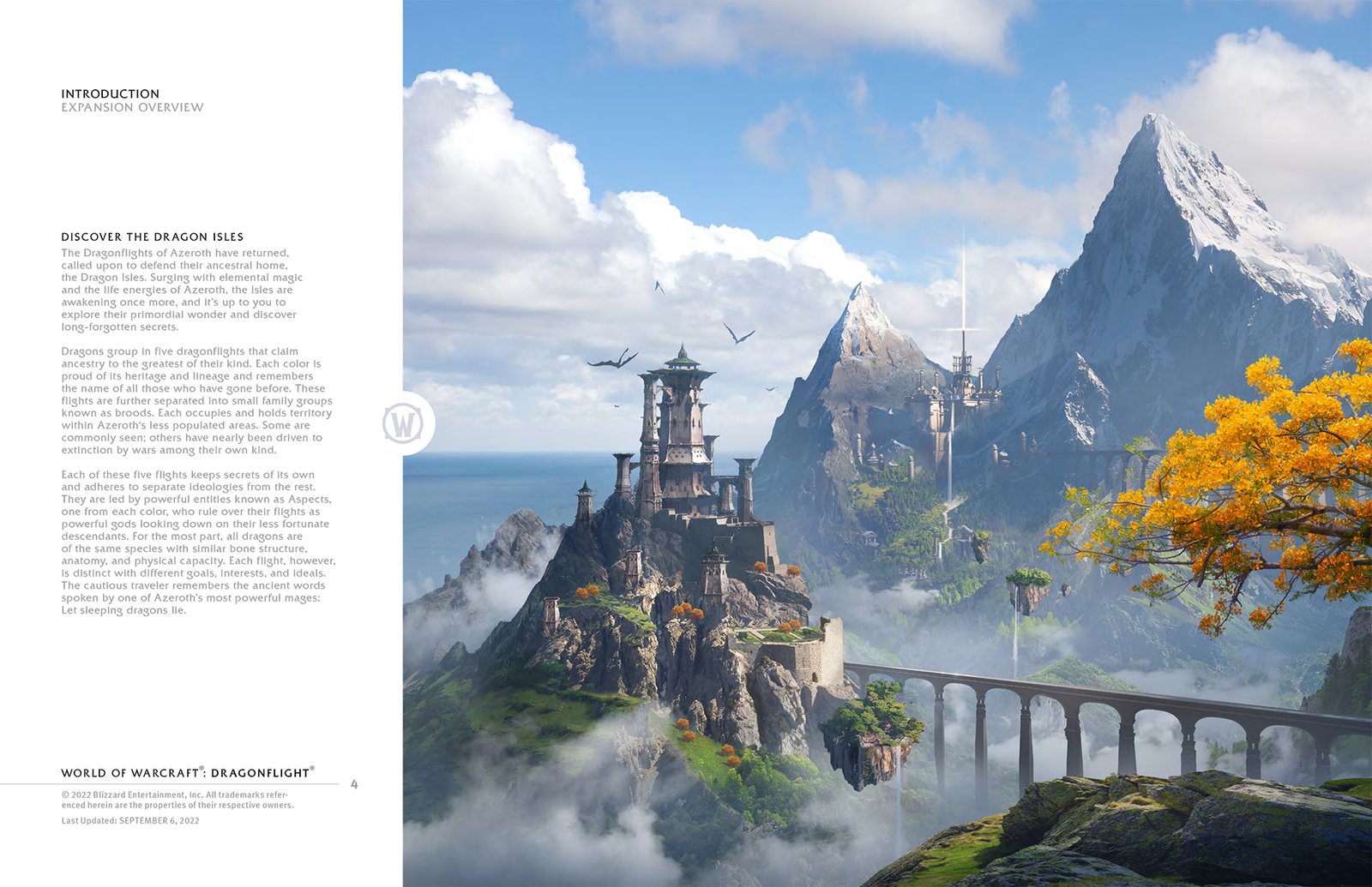
The brief was to craft a full visual identity system that captured the spirit of high fantasy while evolving World of Warcraft’s established aesthetic. The logo needed to feel rooted in Azeroth’s history yet distinct enough to introduce a new era centered on dragons and the rediscovery of the Dragon Isles.
Alongside the logo, I developed the expansion’s style guide, establishing shape language, color direction, textures, iconography, and compositional frameworks. These elements became the visual backbone for teams across cinematics, design, marketing, and in-game development.
Category/Graphic Design & Visual Identity
How It Was Made
Skills
Creative Strategy Logo Design Iconography Typography Shape Language Development Color Theory Visual Identity Systems Style Guide Development Layout Design Collaboration
Tools
Photoshop Illustrator InDesign
Who Made It Possible
Collaborators
Jorge Calleja Erik Jensen Ryan Tretter Alexander Mangold Dino Sulprizio Martin Nguyen Ross Donaldson Paul Finochio
Logo Progression
A look at how the logo evolved from an early concept to the final mark through exploration, refinement, and practical testing.
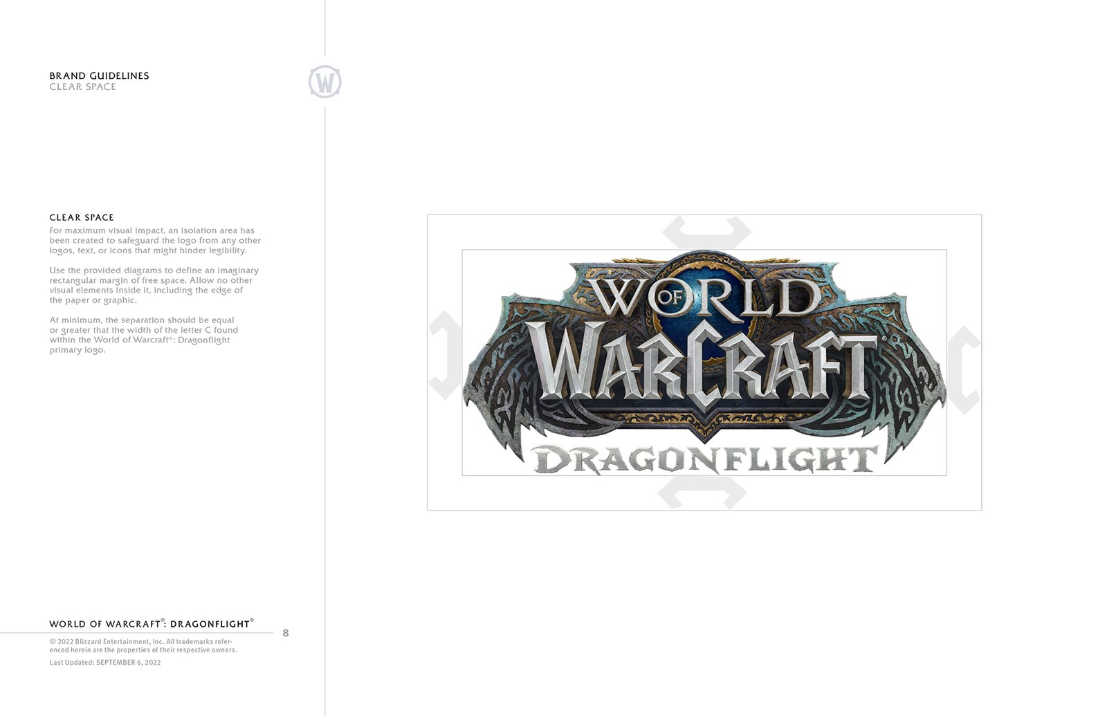
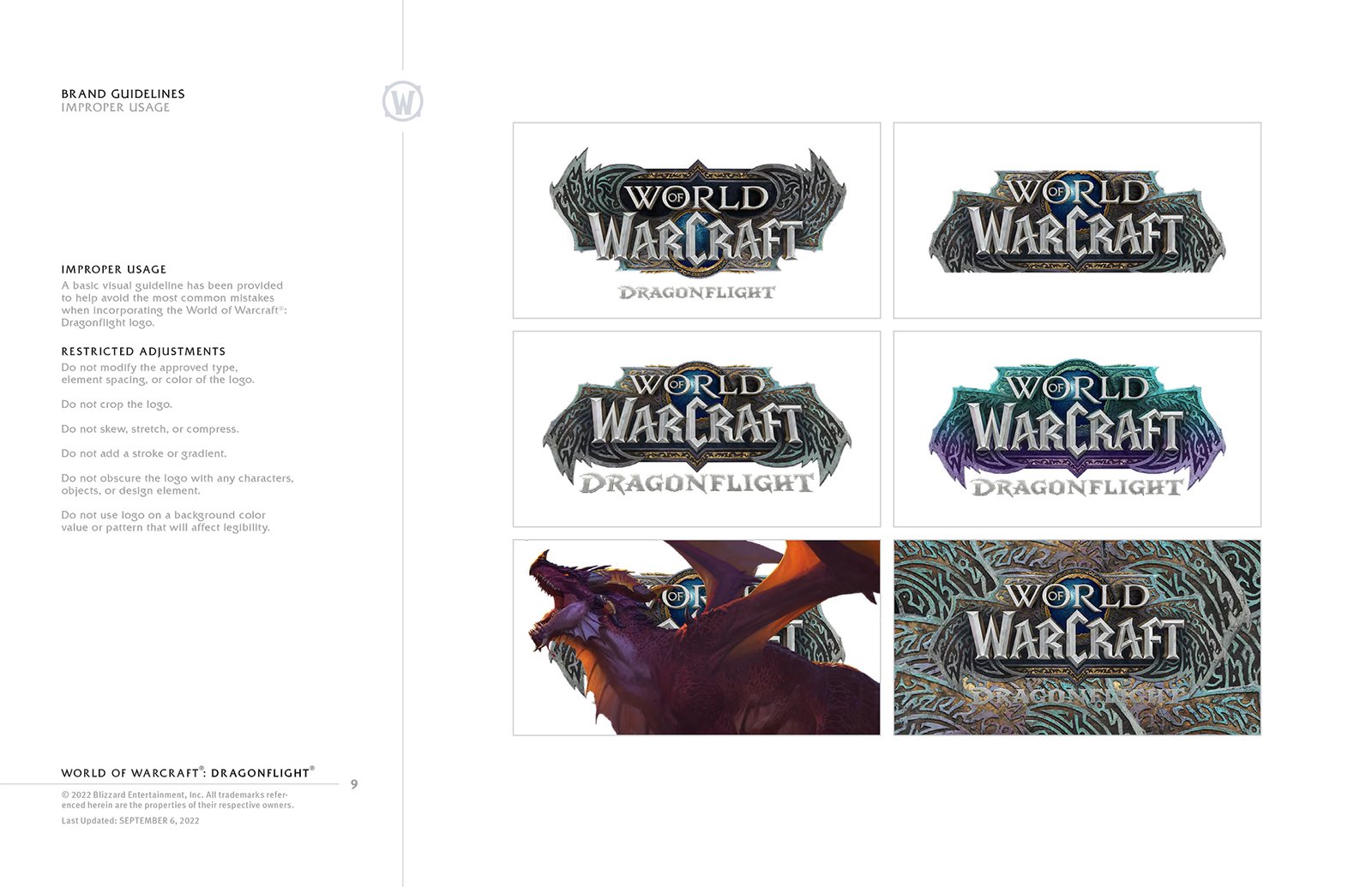
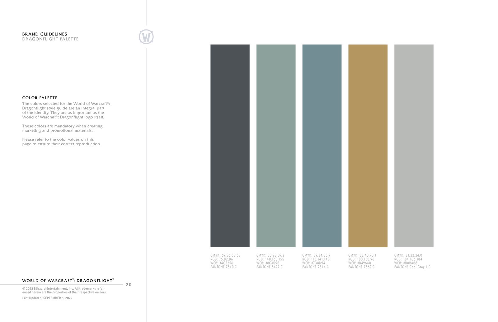
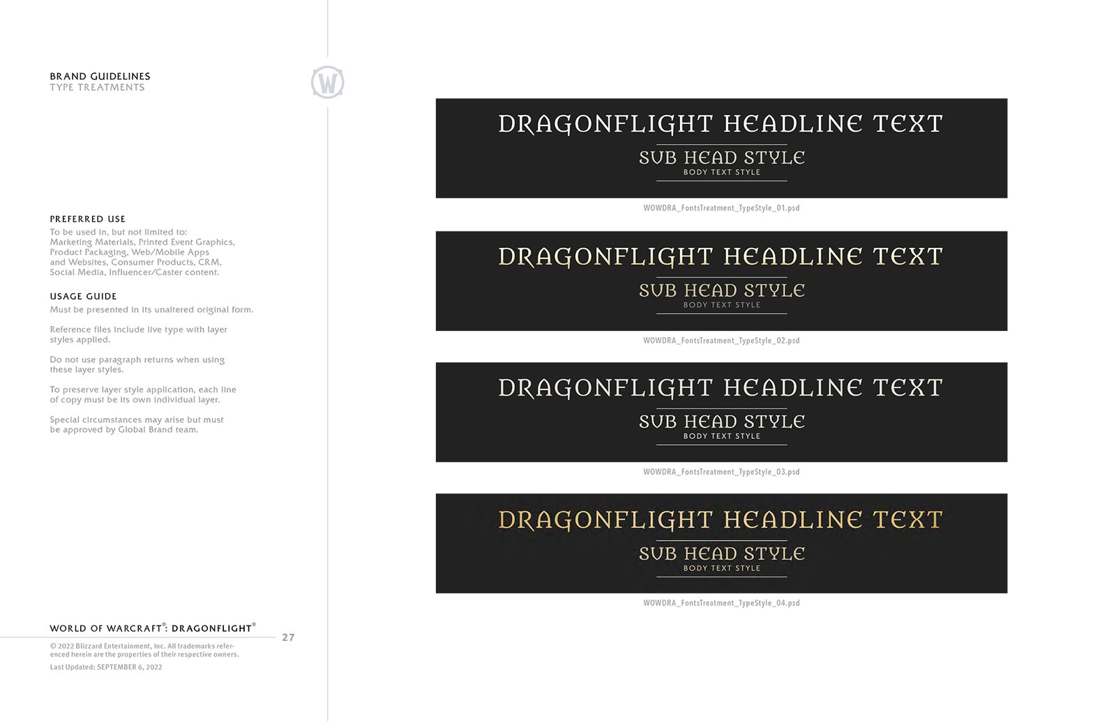
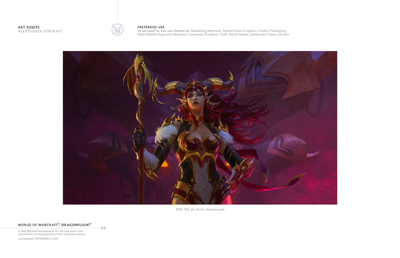
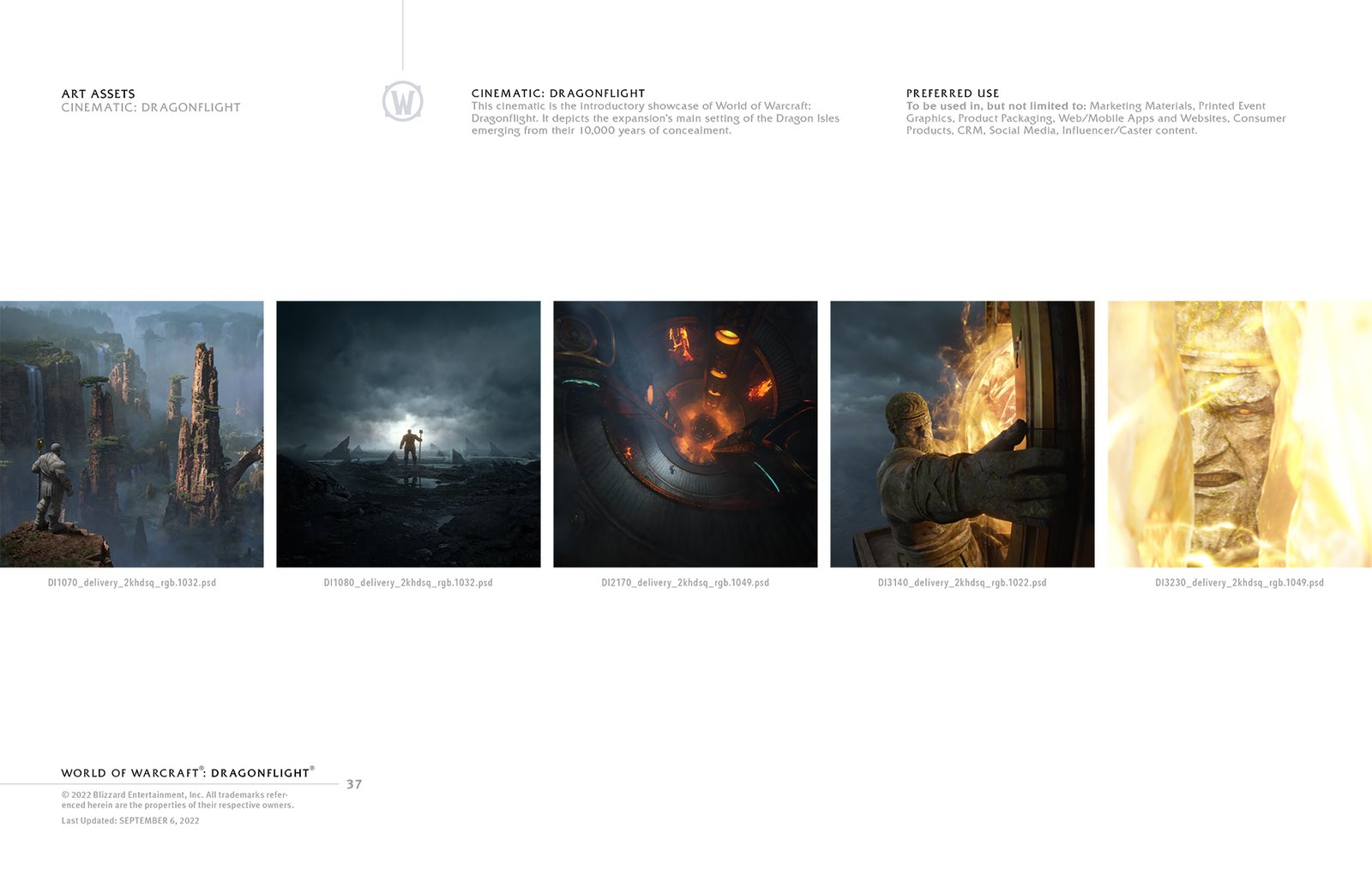
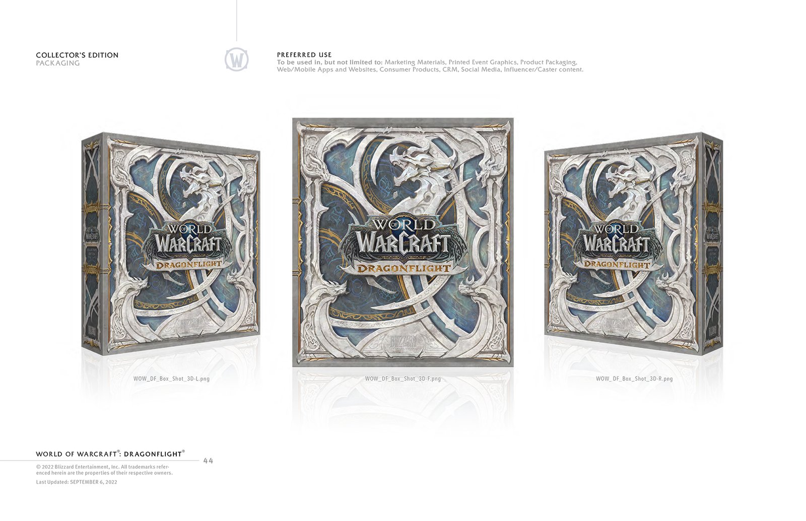
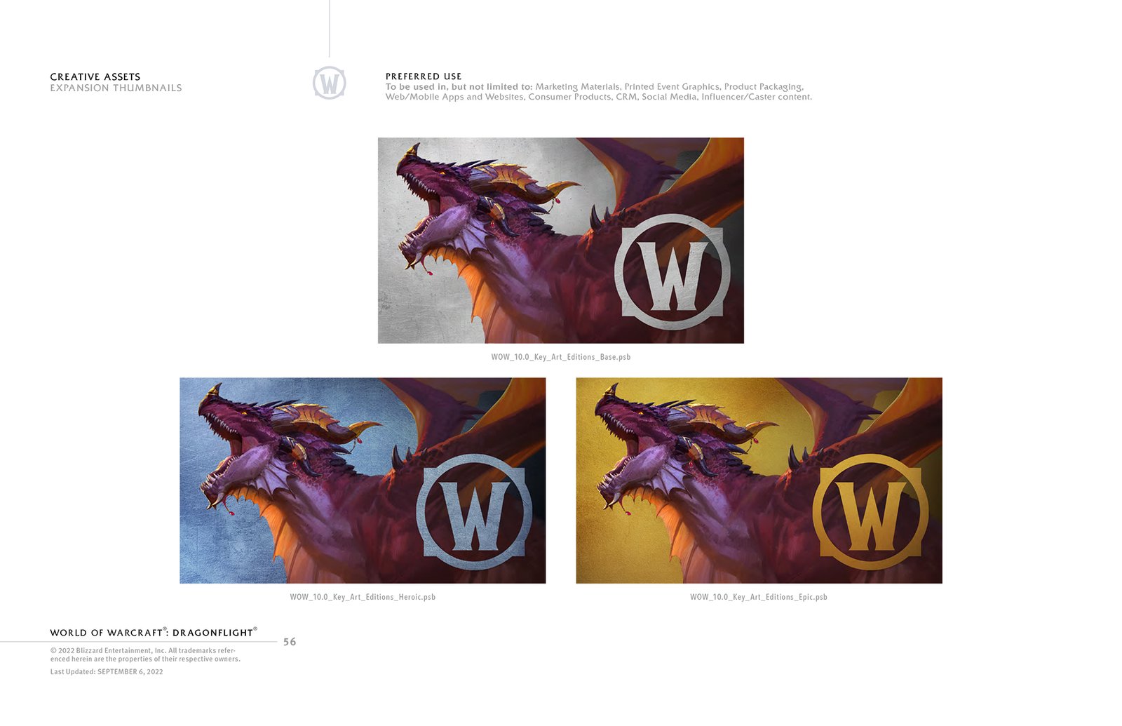
Style Guide Highlights
A snapshot of the key design decisions and visual rules that define how the brand should look, feel, and be applied consistently.