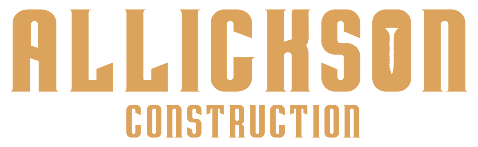
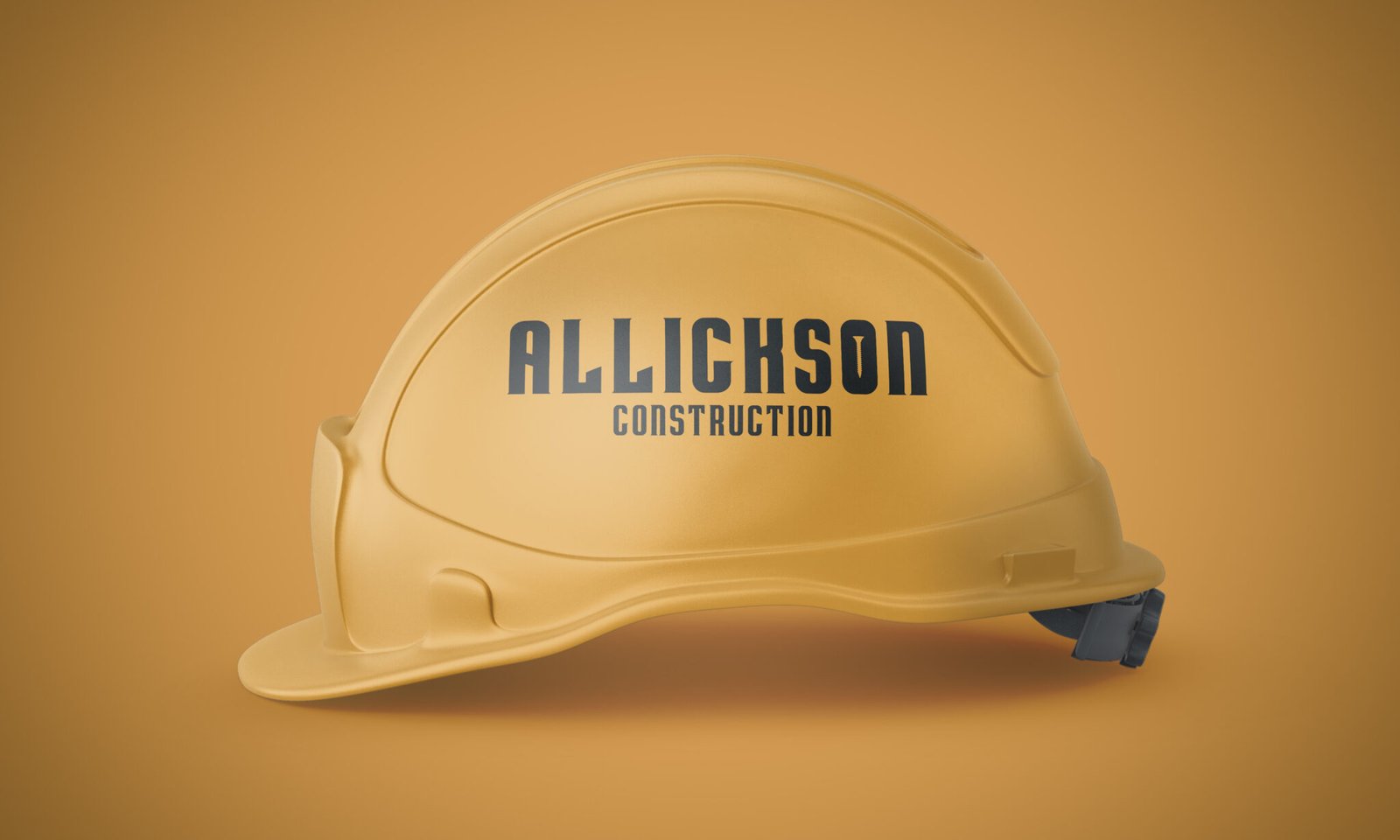
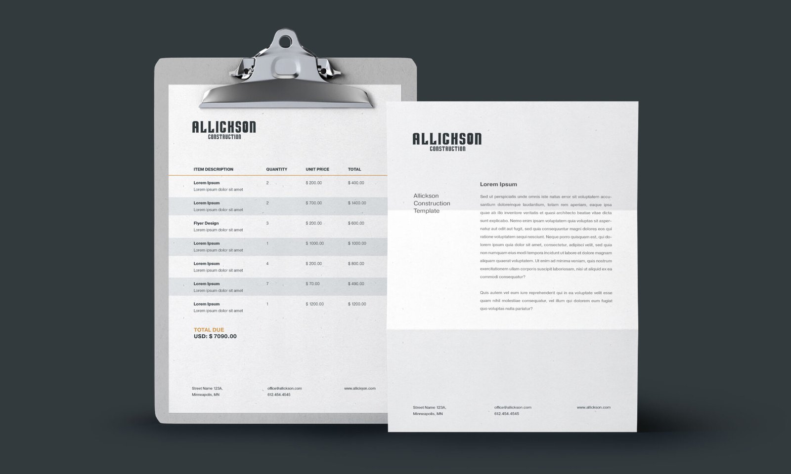
Allickson Construction wanted a brand that felt as solid and dependable as the work his team delivers. I designed a no-nonsense logo and a clean, straightforward identity system grounded in strong typography and subtle design details, all meant to convey craftsmanship, reliability, and pride in the work.
How It Started
Background
Brian Allickson approached me when he felt it was time to update the way his construction company presented itself. His focus has always been on doing quality work, and the brand needed to reflect that mindset with visuals that felt strong, timeless, and trustworthy.
The goal was to create a visual foundation, logo, color palette, typography, and supporting brand assets, that communicated durability and craftsmanship without unnecessary ornamentation.
Category/Logo Design & Branding
How It Was Made
Skills
Art Direction Creative Strategy Logo Design Typography Color Theory Brand Development Collaboration
Tools
Illustrator Photoshop
Who Made It Possible
Collaborators
Brian Allickson
Secondary Elements
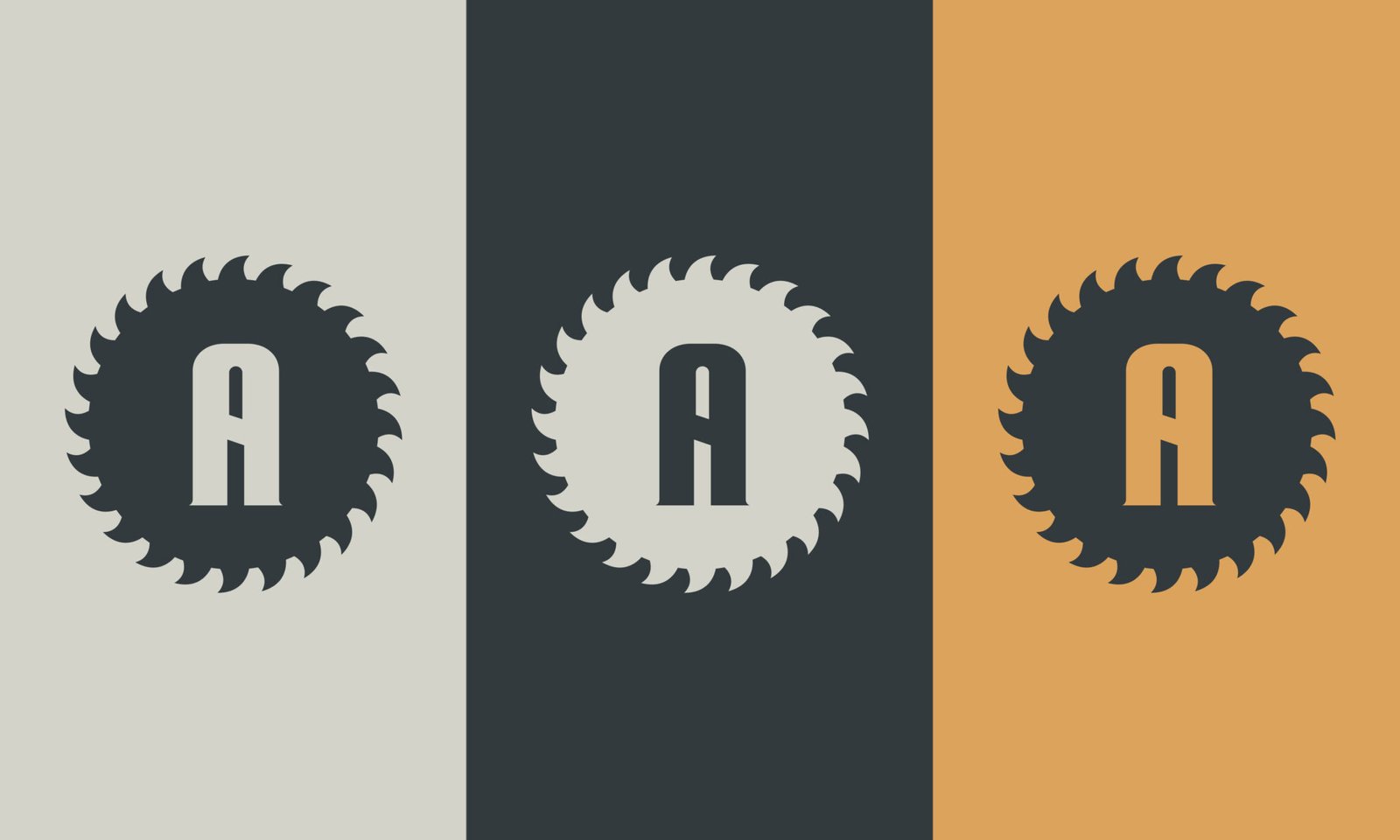
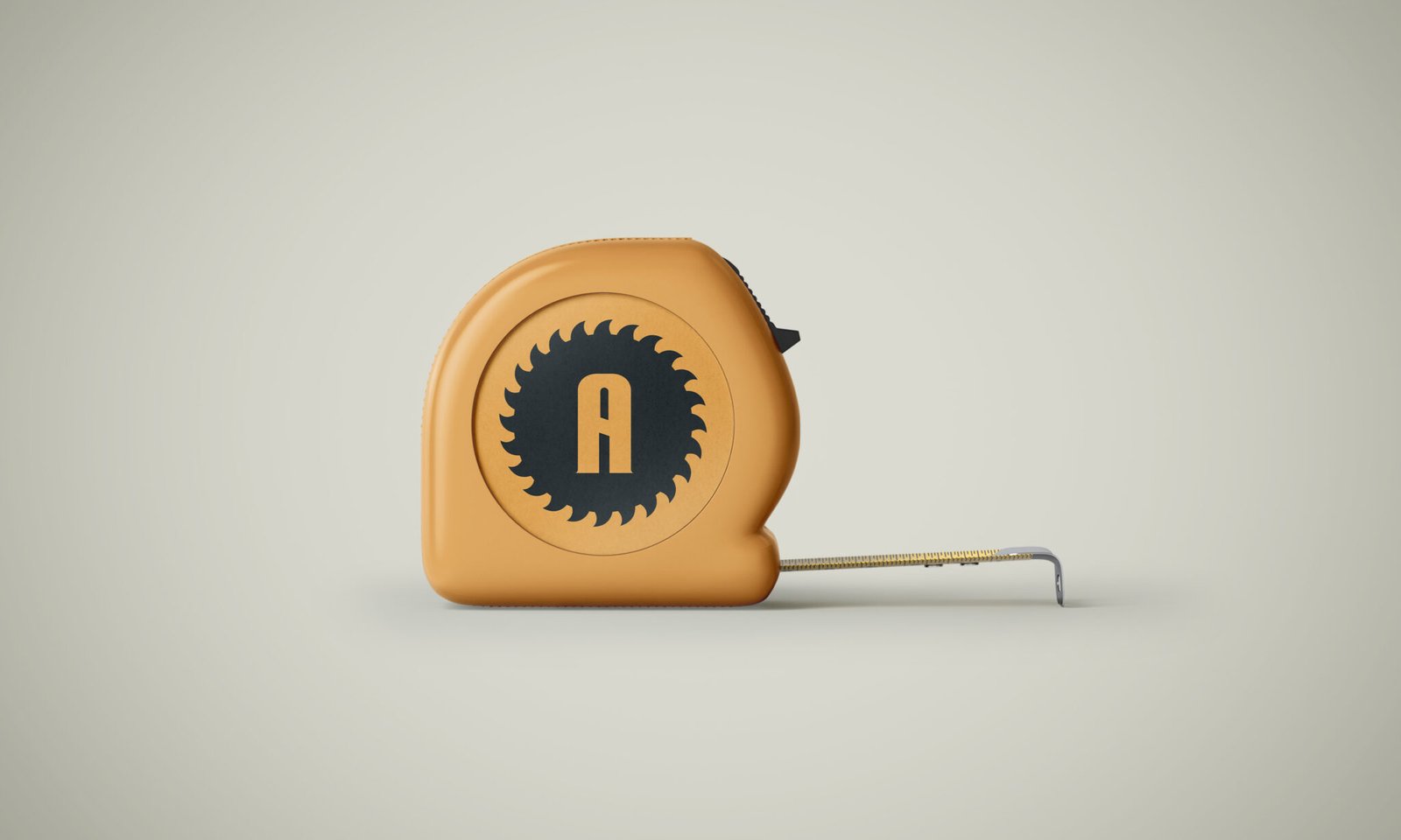
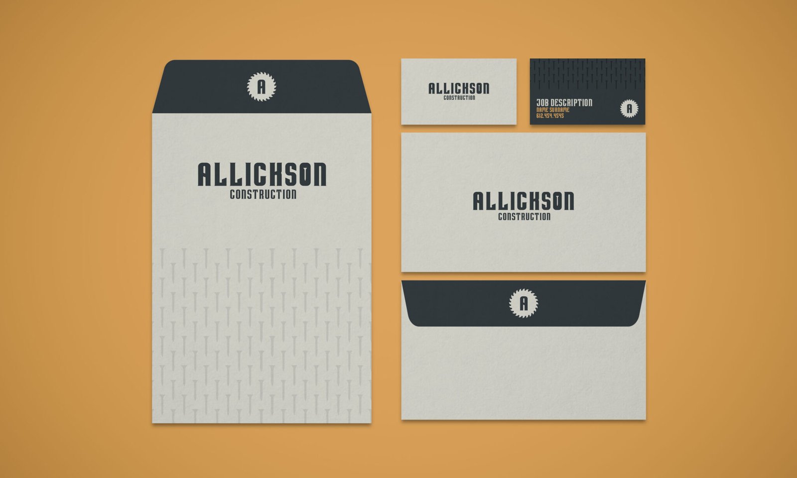
Created a saw blade badge and screw pattern to support the core logo and add visual range across branded materials and customer touch points.