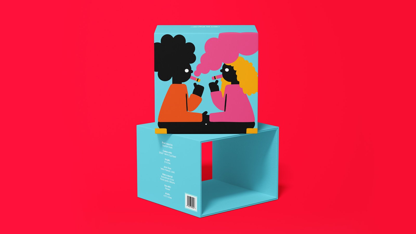
GRAV’s original packaging was practical, but it lacked the personality to match the company’s innovative products. We set out to create a system of packaging that would jump off the shelves and that customers would want to keep.
How It Started
Background
The assignment called for a packaging system that could modernize the look, create stronger shelf presence, and unify the brand across a wide range of products. With dozens of box sizes and formats to accommodate, flexibility was just as important as consistency.
I drove the redesign, working with stakeholders, printers, and product suppliers to bring the system to life. The process balanced creative exploration with practical execution, ensuring that every piece, from small accessories to larger feature products, felt cohesive, on-brand, and production-ready.
Category/Packaging Design
How It Was Made
Skills
Brainstorming Creative Strategy
Print Design Packaging Design Illustration
Typography Color Theory
Press Check Collaboration
Tools
Illustrator
Who Made It Possible
Collaborators
David Daily Tristen Blackett Kirsten Allen Jordan Box
Can you capture someone in a single frame?
Portraits are a snapshot of who someone is in that moment. Sometimes it’s in the way they hold themselves, sometimes it’s a look in their eyes, or even the split second before a smile breaks. My goal is to capture someone's spirit and do it in a way that catches your eye. This collection is a showcase of some of the people I've met, in different places, moods, and lights.
Adrian Arroyo | Zenaikah Belvedere | Jimmy Bennett III | Corey Biggs | Mallory Butcher | Stephany Camacho | Krystle Delgado | Amber Ford | Jean Marie Golden | Sara Grady | Alexa Hatt | Becca Hayden | Angela Kaylor | Leidy Lozano Lopez | Garrett Marchbank | Rebekka Martta | Kelley McCoy | Annie McLaughlin | Martin Nguyen | Brenn O’shea | Dani Opal | James Robert Pulido | Marcia Rondonuwu | Kelly Singh | Lily Tamm | Natalie Tischler | Myesha Williams | Shir Zehavy
Adrian Arroyo | Zenaikah Belvedere | Jimmy Bennett III | Corey Biggs | Mallory Butcher | Stephany Camacho | Krystle Delgado | Amber Ford | Jean Marie Golden | Sara Grady | Alexa Hatt | Becca Hayden | Angela Kaylor | Leidy Lozano Lopez | Garrett Marchbank | Rebekka Martta | Kelley McCoy | Annie McLaughlin | Martin Nguyen | Brenn O’shea | Dani Opal | James Robert Pulido | Marcia Rondonuwu | Kelly Singh | Lily Tamm | Natalie Tischler | Myesha Williams | Shir Zehavy
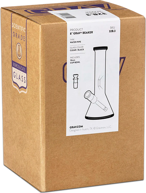
Uninspired Packaging
GRAV’s original packaging relied on plain brown cardboard with minimal graphics, designed more for warehouse readability than for the customer experience. While functional, it lacked shelf presence and didn’t reflect the personality of the products inside.
Creating the Building Blocks
Logo Refinement
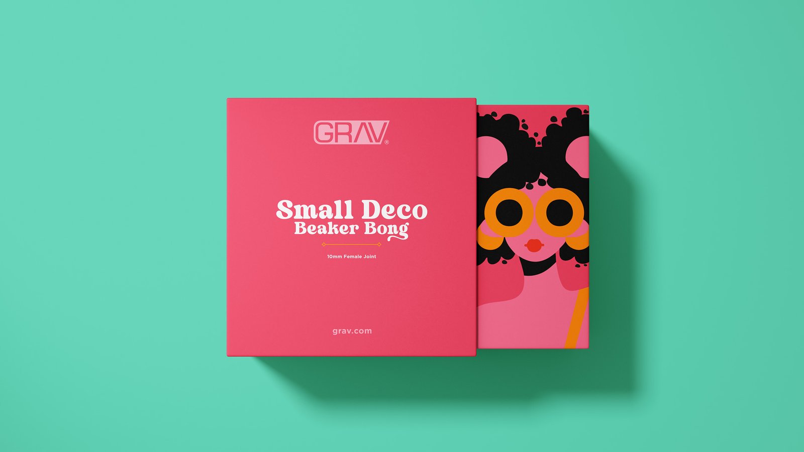
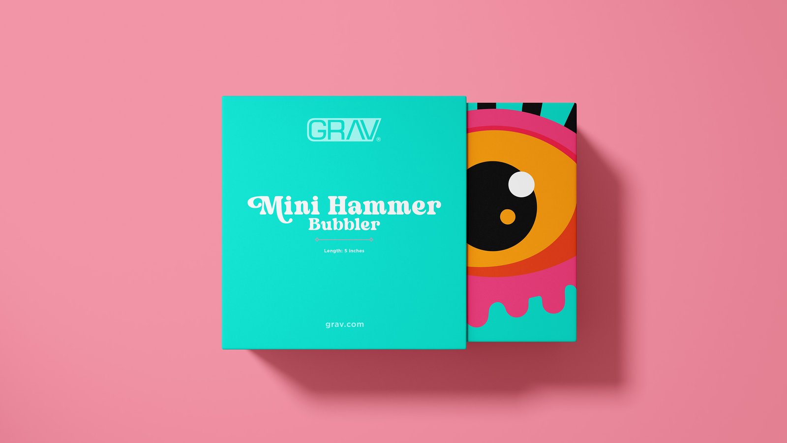
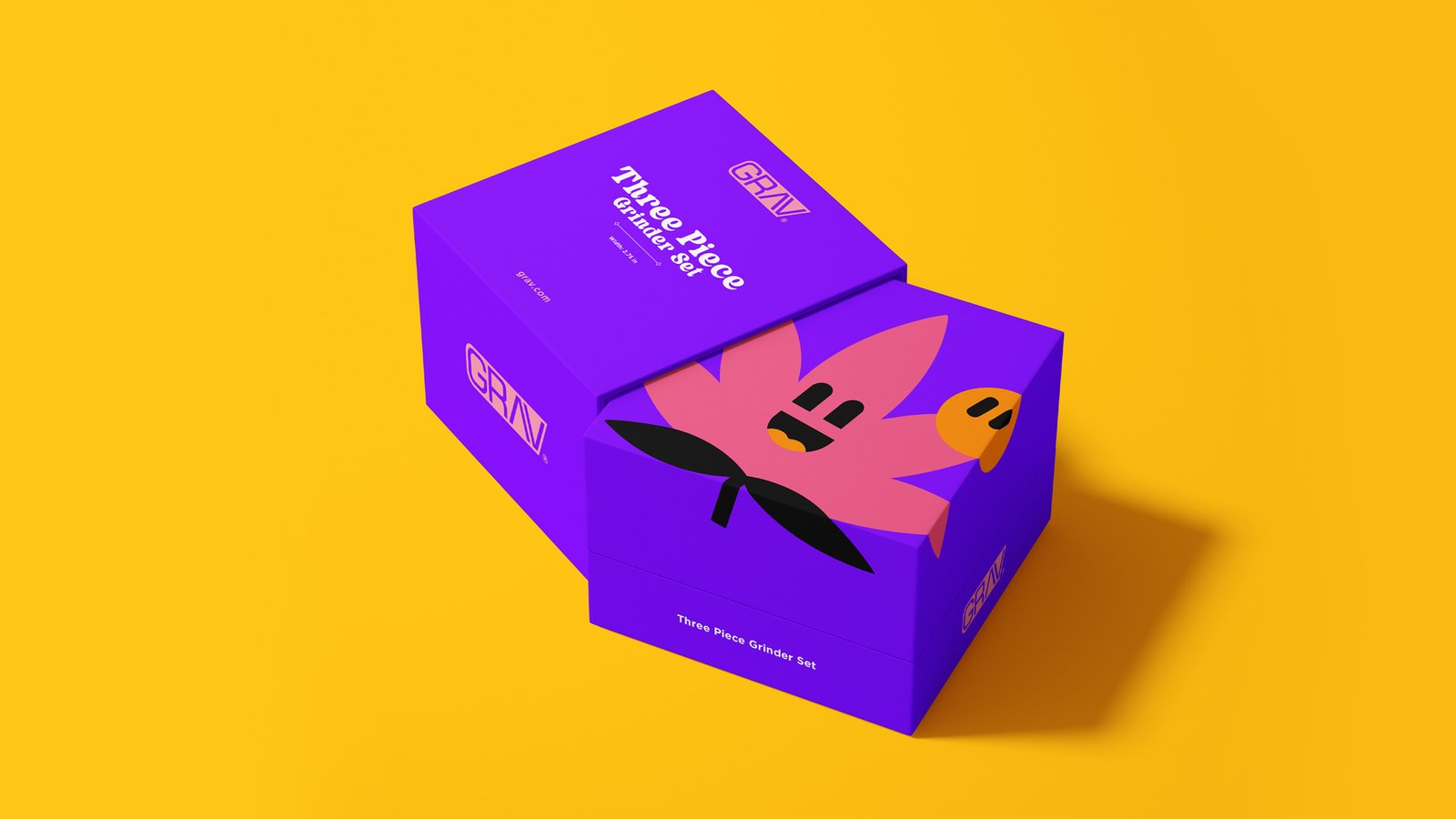
After the company updated from Grav Labs to GRAV, I updated the logo by refining the shapes so that the wordmark felt bolder and more balanced.
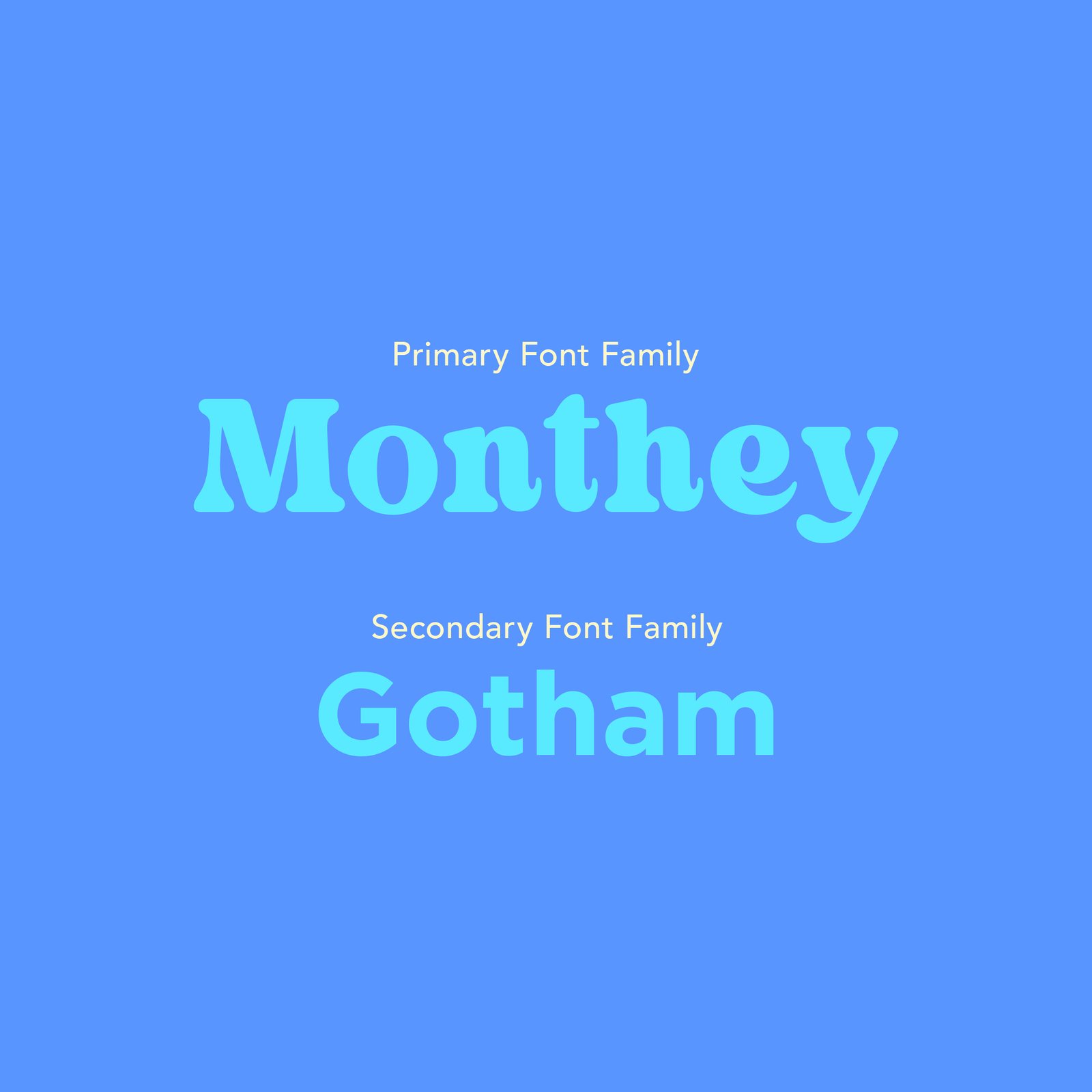
Updated Typography
Inspired by the free-spirited past of counterculture and the clean lines of today’s smoke shops, I chose fonts that blended retro and contemporary styles to give the system a distinct yet flexible voice.
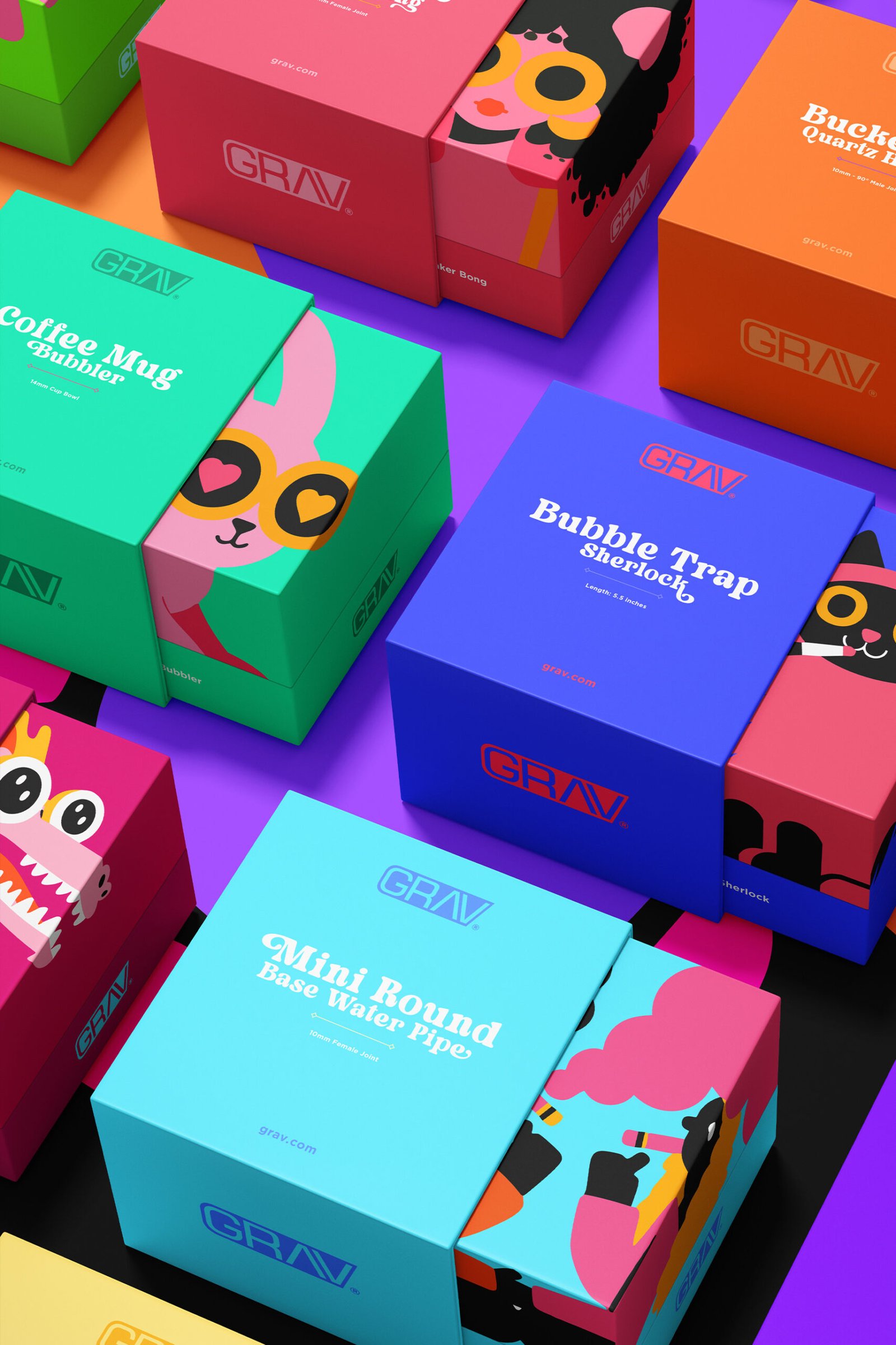
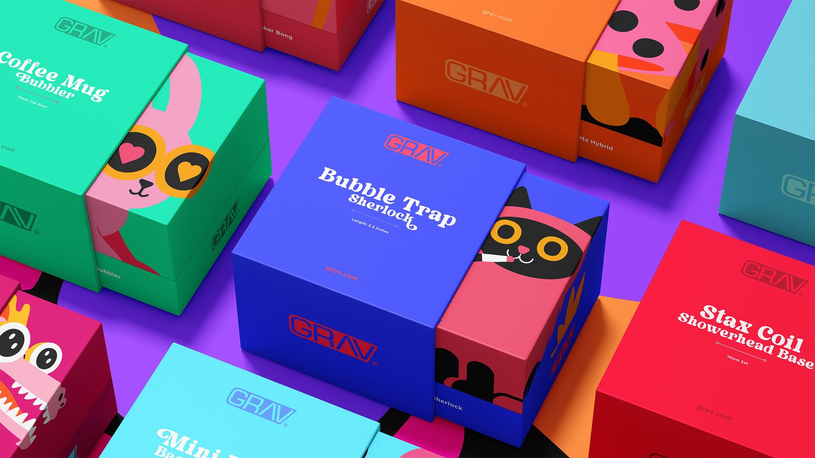
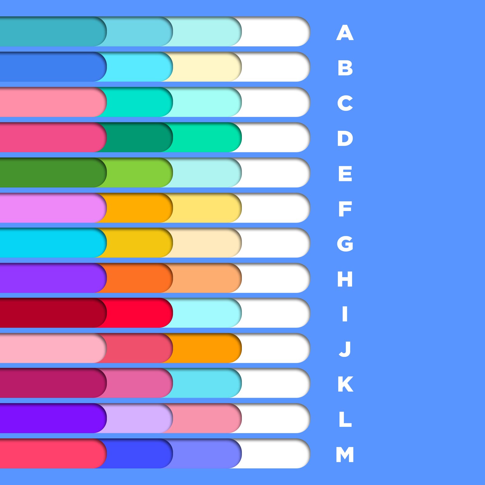
Fresh Colors
Bright, bold color palettes with unexpected pairings pushed the brand further, turning every package into an opportunity to catch someone's eye.
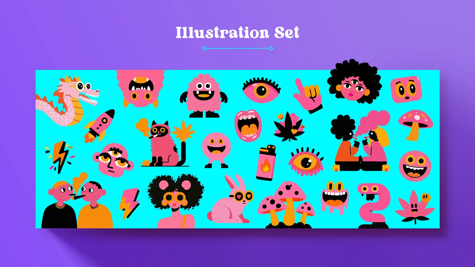
Original Illustrations
Lastly I created custom illustrations to give each package its own personality while still feeling part of a unified system.