Allickson Construction wanted a brand that felt as solid and dependable as the work his team delivers. I designed a no-nonsense logo and a clean, straightforward identity system grounded in strong typography and subtle design details, all meant to convey craftsmanship, reliability, and pride in the work.
How It Started
Background
Brian Allickson approached me when he felt it was time to update the way his construction company presented itself. His focus has always been on doing quality work, and the brand needed to reflect that mindset with visuals that felt strong, timeless, and trustworthy.
The goal was to create a visual foundation, logo, color palette, typography, and supporting brand assets, that communicated durability and craftsmanship without unnecessary ornamentation.
Category/Logo Design & Branding
How It Was Made
Skills
Art Direction Creative Strategy Logo Design Typography Color Theory Brand Development Collaboration
Tools
Illustrator Photoshop
Who Made It Possible
Collaborators
Brian Allickson
Can you capture someone in a single frame?
Portraits are a snapshot of who someone is in that moment. Sometimes it’s in the way they hold themselves, sometimes it’s a look in their eyes, or even the split second before a smile breaks. My goal is to capture someone's spirit and do it in a way that catches your eye. This collection is a showcase of some of the people I've met, in different places, moods, and lights.
Adrian Arroyo | Zenaikah Belvedere | Jimmy Bennett III | Corey Biggs | Mallory Butcher | Stephany Camacho | Krystle Delgado | Amber Ford | Jean Marie Golden | Sara Grady | Alexa Hatt | Becca Hayden | Angela Kaylor | Leidy Lozano Lopez | Garrett Marchbank | Rebekka Martta | Kelley McCoy | Annie McLaughlin | Martin Nguyen | Brenn O’shea | Dani Opal | James Robert Pulido | Marcia Rondonuwu | Kelly Singh | Lily Tamm | Natalie Tischler | Myesha Williams | Shir Zehavy
Adrian Arroyo | Zenaikah Belvedere | Jimmy Bennett III | Corey Biggs | Mallory Butcher | Stephany Camacho | Krystle Delgado | Amber Ford | Jean Marie Golden | Sara Grady | Alexa Hatt | Becca Hayden | Angela Kaylor | Leidy Lozano Lopez | Garrett Marchbank | Rebekka Martta | Kelley McCoy | Annie McLaughlin | Martin Nguyen | Brenn O’shea | Dani Opal | James Robert Pulido | Marcia Rondonuwu | Kelly Singh | Lily Tamm | Natalie Tischler | Myesha Williams | Shir Zehavy
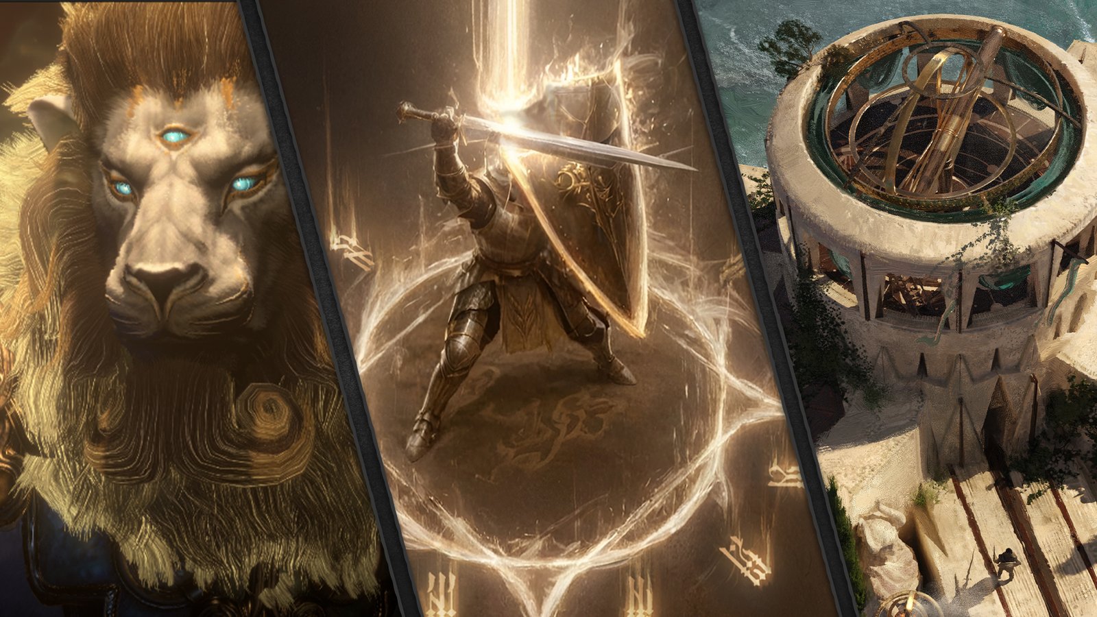
Initial Concepts
Early development focused on two creative directions.
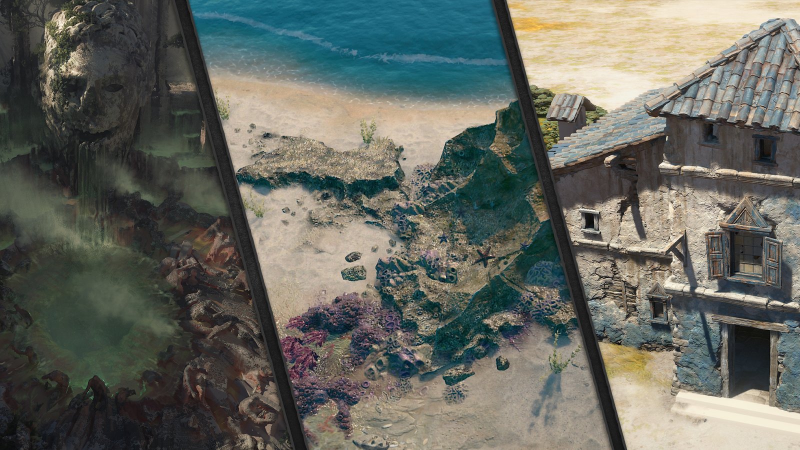
SKOVOS ISLES
Skovos Isles is a new island region developed for Diablo IV: Lord of Hatred, using motifs inspired by maritime culture and ancient warrior civilizations.
THE LIGHT
Religious imagery tied to the Paladin, Akarat, and themes meant to stand in visual opposition to Diablo’s usual hell driven iconography.
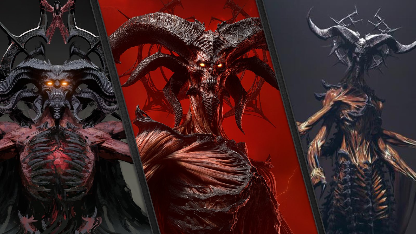
Shift in Focus
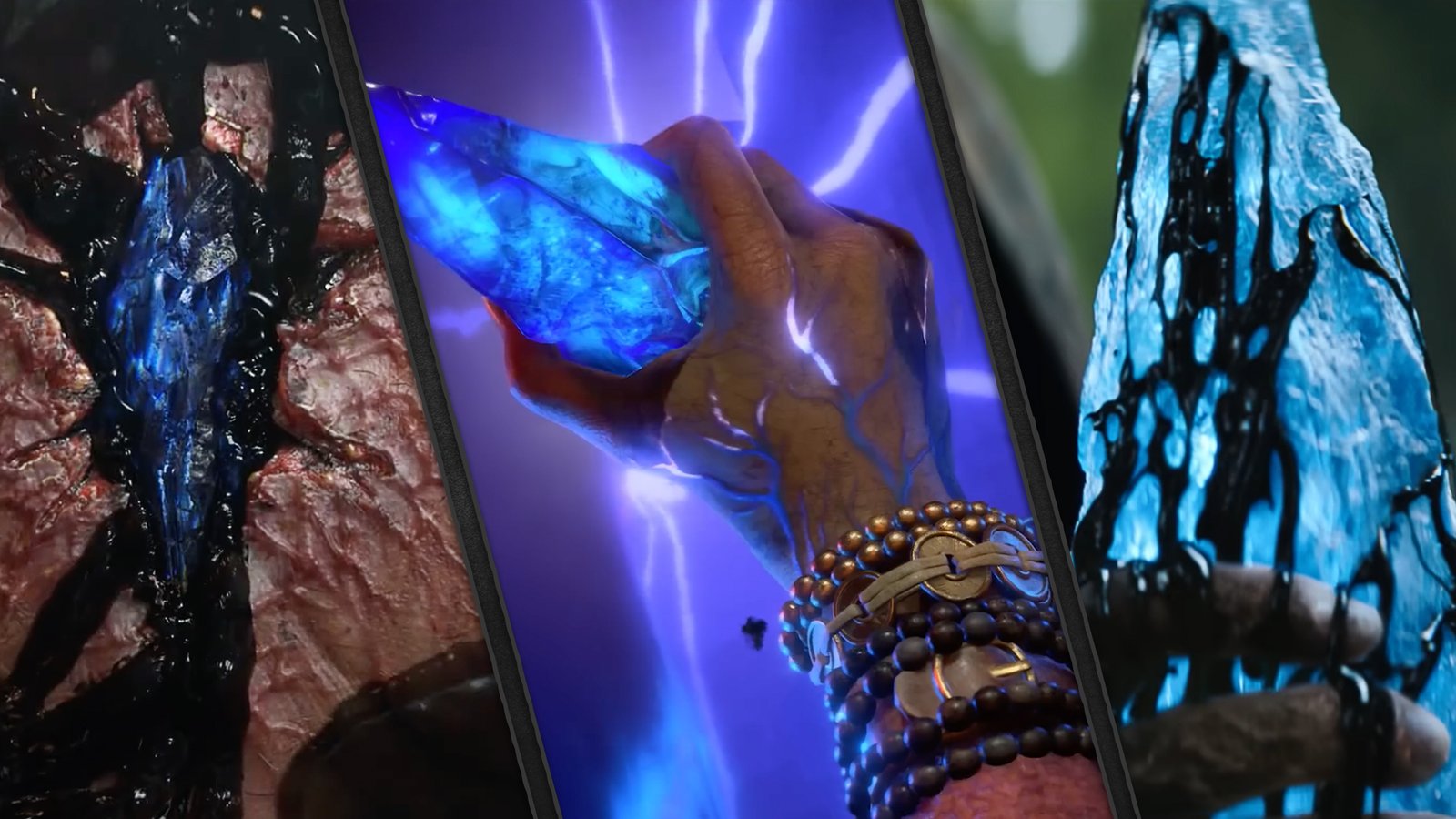
Rather than continuing to evolve early concepts, we were instructed to pivot completely to Mephisto. In addition to Mephisto himself, we were asked to explore the blue soul stone and spreading black ichor as physical representations of his identity and corruption.
Chosen Direction
Initally a direction was selected, but after additonal alignment with the dev team the decision was made to return the color palette to red to restore a sense of Diablo's identity. Further discussions led to another name change and integrating the ichor and Mephisto's halo into the design.
Final Polish
We received Mephisto’s halo from the Cinematics team which was originally developed for the launch cinematic and integrated it into the logo. From there, we refined surface texture, lighting, scale, and spatial relationships between the halo, title lockup, and IV mark land on the final look.
Animated Version
The logo was handed off to the cinematics team to rebuild for a 3D space and they created the animated version.
At this point, I was no longer in a hands-on role and became a member of the team providing creative direction.