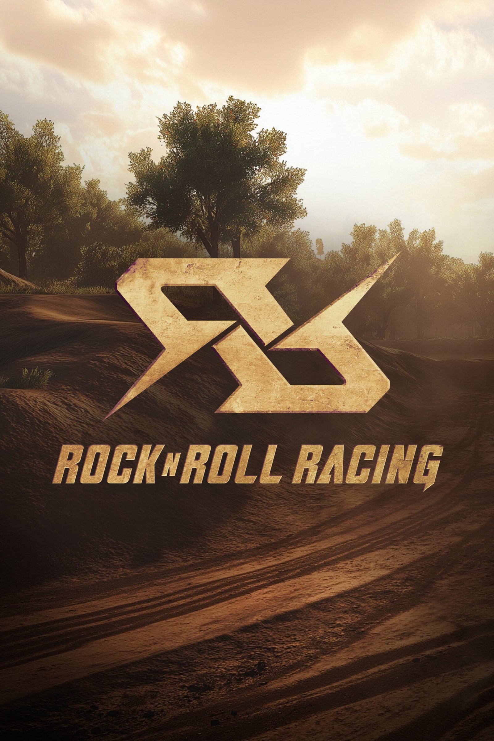
Blizzard Entertainment brought back Rock ‘n’ Roll Racing as part of the Arcade Collection, delivering a version that respects the game’s cult-classic roots while cranking the intensity up to 11. My task was to design a logo that captured that same spirit, something that screams metal, explosions, and carnage. The final design pays tribute to the original while embracing the enhancements of the update.
How It Started
Background
The challenge was to reimagine the logo in a way that felt instantly nostalgic to long-time fans, yet polished and powerful enough to sit confidently within a modern remaster. The redesign needed to balance homage with evolution, capturing the raw spirit of the original while elevating it for new platforms and audiences.
Category/Logo Design
How It Was Made
Skills
Brainstorming Creative Strategy
Sketching Typography Symbol Design Color Theory Brand Development Collaboration
Tools
Illustrator Photoshop
Who Made It Possible
Collaborators
Jorge Callega Hector Bolanos Dolee Jung Ben Scanlon
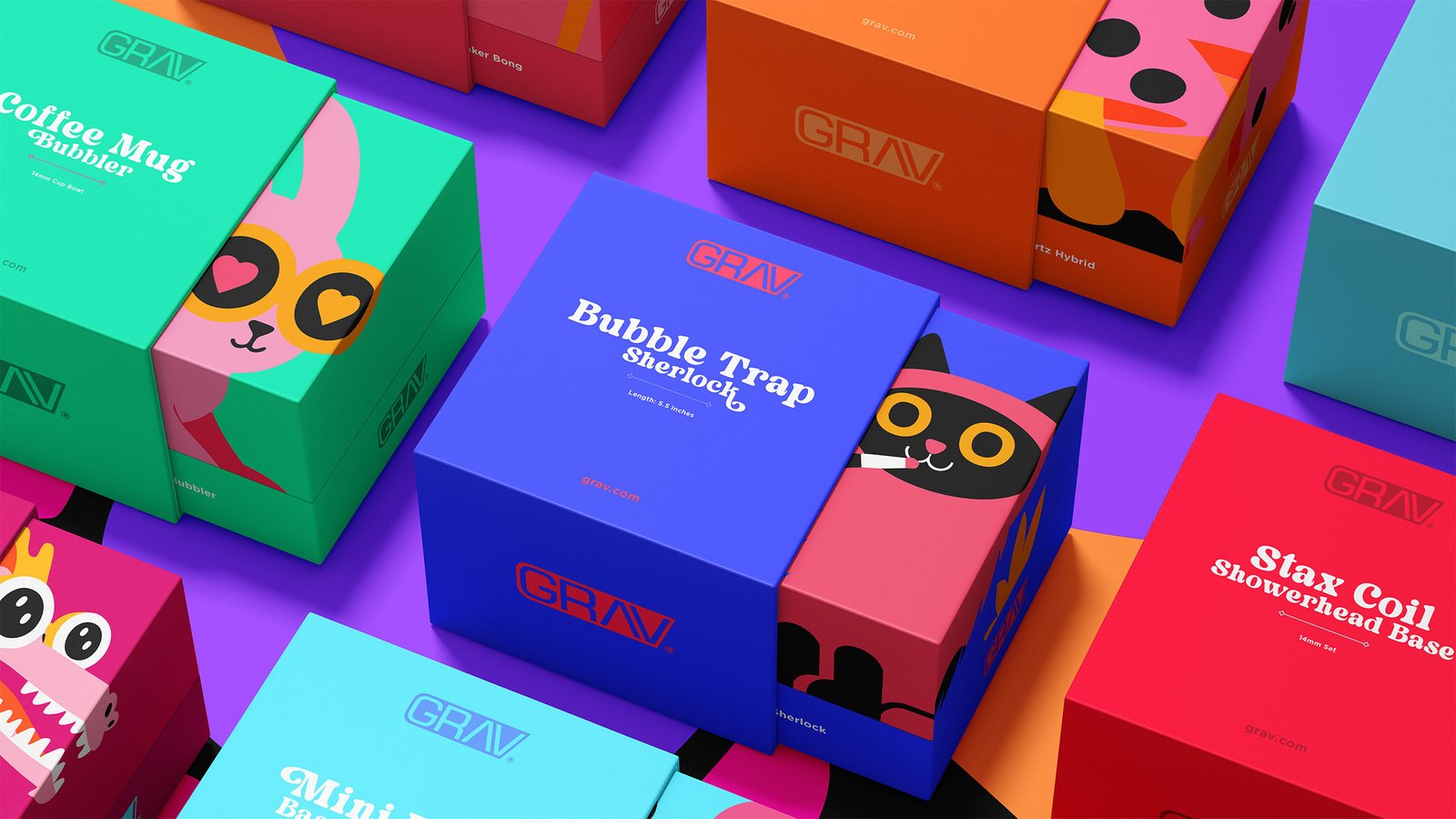
What makes packaging worth saving?
GRAV’s original packaging was practical, but it lacked the personality to match the company’s innovative products. We set out to create a system of packaging that would jump off the shelves and that customers would want to keep.
Project Progression
Early Rounds, Unused Concepts, and Logo Refinement