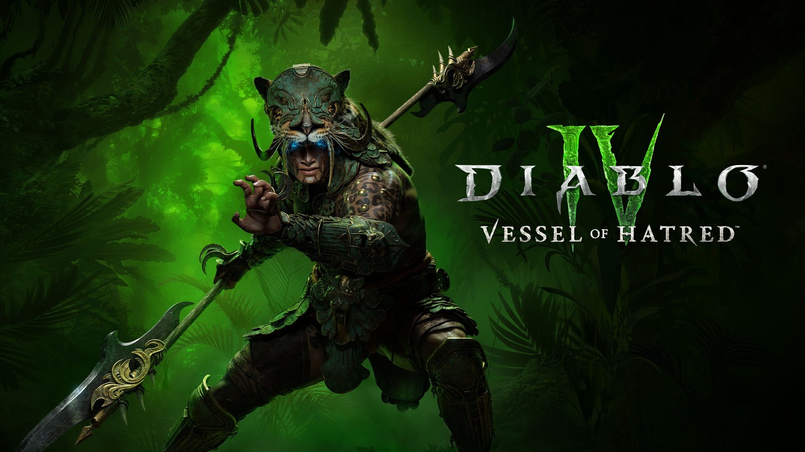
For the Vessel of Hatred expansion, I developed the visual toolkit that supports the game’s promotional and in-universe creative. I developed every aspect of the visual language, backgrounds, dividers, icons, patterns, buttons, and type treatments to capture the jungle atmosphere of Nahantu and the rising threat of Mephisto.
How It Started
Background
The brief was to establish a cohesive visual identity for Vessel of Hatred, the expansion that continues the story after Diablo IV’s campaign. The toolkit needed to reflect the dangerous jungles of Nahantu, the lingering corruption of Mephisto, and the tension surrounding Neyrelle’s journey, all while integrating seamlessly into the existing Diablo IV visual universe.
My role was to create flexible assets that could scale across a wide range of uses, from marketing beats and key art layouts to in-client UI and partner executions. This included atmospheric backgrounds, ornamental dividers, shape motifs, button styles, and typographic treatments that felt distinct to the expansion while remaining authentically Diablo.
Category/Graphic Design & Visual Identity
How It Was Made
Skills
Brainstorming Creative Strategy
Layout Design Shape Language Creation Illustration
Typography Collaboration
Tools
Photoshop Illustrator
Who Made It Possible
Collaborators
John Mueller Michael Carrillo Daniela Rodriguez Dino Sulprizio Laura Miller
Can you capture someone in a single frame?
Portraits are a snapshot of who someone is in that moment. Sometimes it’s in the way they hold themselves, sometimes it’s a look in their eyes, or even the split second before a smile breaks. My goal is to capture someone's spirit and do it in a way that catches your eye. This collection is a showcase of some of the people I've met, in different places, moods, and lights.
Adrian Arroyo | Zenaikah Belvedere | Jimmy Bennett III | Corey Biggs | Mallory Butcher | Stephany Camacho | Krystle Delgado | Amber Ford | Jean Marie Golden | Sara Grady | Alexa Hatt | Becca Hayden | Angela Kaylor | Leidy Lozano Lopez | Garrett Marchbank | Rebekka Martta | Kelley McCoy | Annie McLaughlin | Martin Nguyen | Brenn O’shea | Dani Opal | James Robert Pulido | Marcia Rondonuwu | Kelly Singh | Lily Tamm | Natalie Tischler | Myesha Williams | Shir Zehavy
Adrian Arroyo | Zenaikah Belvedere | Jimmy Bennett III | Corey Biggs | Mallory Butcher | Stephany Camacho | Krystle Delgado | Amber Ford | Jean Marie Golden | Sara Grady | Alexa Hatt | Becca Hayden | Angela Kaylor | Leidy Lozano Lopez | Garrett Marchbank | Rebekka Martta | Kelley McCoy | Annie McLaughlin | Martin Nguyen | Brenn O’shea | Dani Opal | James Robert Pulido | Marcia Rondonuwu | Kelly Singh | Lily Tamm | Natalie Tischler | Myesha Williams | Shir Zehavy
Collector's Edition
World of Warcraft: Dragonflight
Each World of Warcraft expansion has been accompanied by a Collector’s Edition. These sets are prized by fans as both functional upgrades and collectible pieces of Blizzard history. The Dragonflight Collector's Edition featured a hardcover art book, a pin set of the Dragon Aspects, a themed mousepad, and the Epic Edition digital game key with exclusive in-game items.
I was honored to work alongside another designer to bring the art book to life and to work with a variety of team members to build the packaging for the complete set. Below are selected pages from the art book as well as a link to the entire layout.
Creating the Building Blocks
Backgrounds
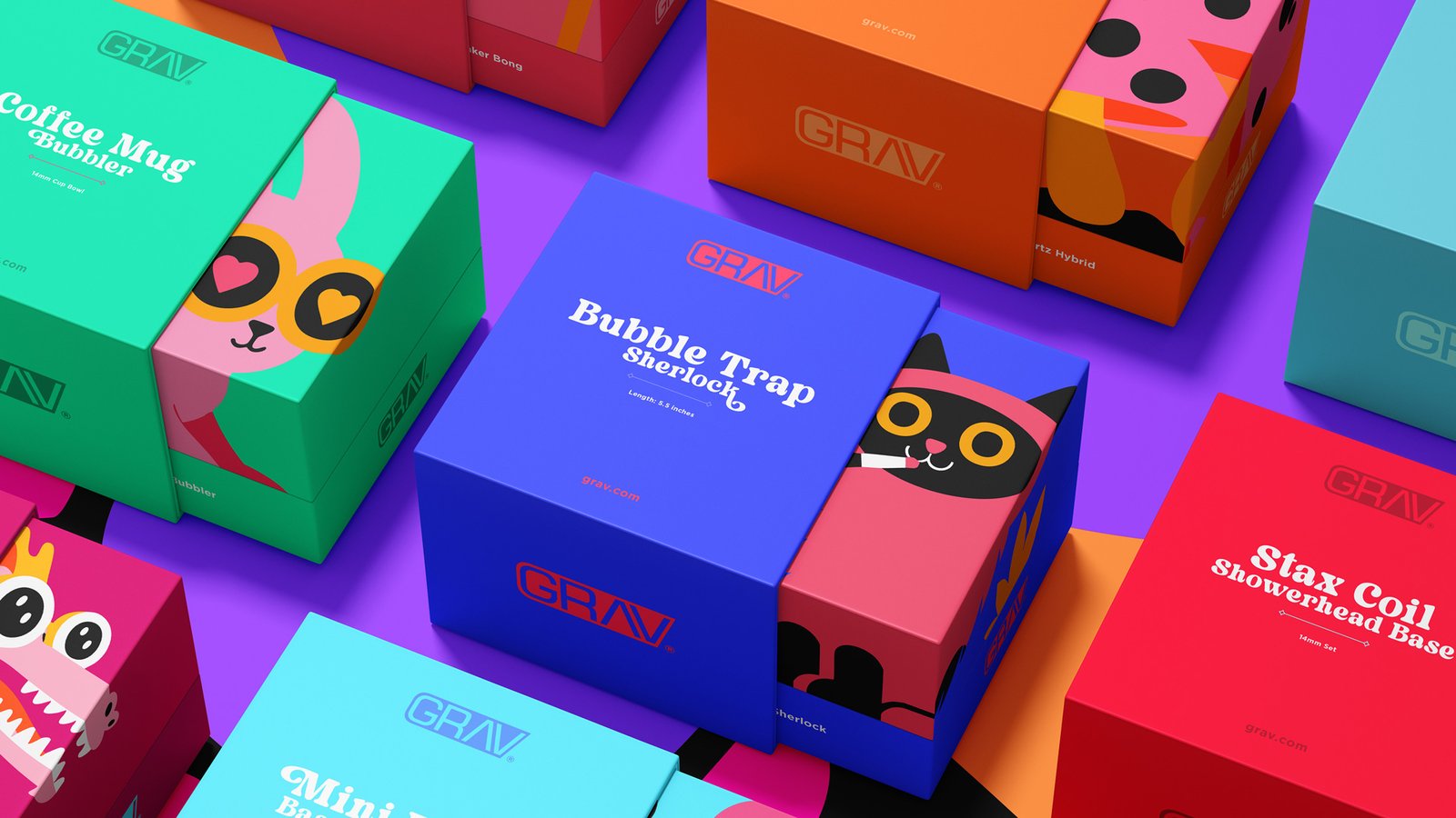
After the company updated from Grav Labs to GRAV, I updated the logo by refining the shapes so that the wordmark felt bolder and more balanced.
Shape Language
Inspired by the free-spirited past of counterculture and the clean lines of today’s smoke shops, I chose fonts that blended retro and contemporary styles to give the system a distinct yet flexible voice.
Patterns
Bright, bold color palettes with unexpected pairings pushed the brand further, turning every package into an opportunity to catch someone's eye.
Foliage
Bright, bold color palettes with unexpected pairings pushed the brand further, turning every package into an opportunity to catch someone's eye.
Original Illustrations
Lastly I created custom illustrations to give each package its own personality while still feeling part of a unified system.
Original Illustrations
Lastly I created custom illustrations to give each package its own personality while still feeling part of a unified system.
Original Illustrations
Lastly I created custom illustrations to give each package its own personality while still feeling part of a unified system.
Original Illustrations
Lastly I created custom illustrations to give each package its own personality while still feeling part of a unified system.